5 Landing Page Examples for Healthcare Brands
I love working with healthcare startups because they always work on the coolest things, especially in healthcare technology.
But their messaging is tricky.
Some healthcare brands speak to patients and healthcare practices. Some healthcare tech brands struggle with jargony lingo. And other brands throw a chart full of information that leaves you dazed and confused.
Here are five examples of healthcare brands doing a wonderful job around landing pages.
1. Make the Above the Fold Crisp, Clear, and Captivating
PatientPop’s landing page does a lot of things right.
They call out their customer (people with practices) and tease an outcome (thrive). There’s also so much awesomeness that goes beyond the headline.
For example, the subheadline clearly defines what PatientPop does and what it claims to do. They also give you choices and a clear image to support their claims.

2. Know the Stage of Awareness of Your Customers
There are five stages of awareness:
- Stage 1: Unaware.
- Stage 2: Pain Aware or Problem Aware.
- Stage 3: Solution Aware.
- Stage 4: Product Aware.
- Stage 5: Most Aware.
If the audience you’re driving to your website is unaware of a problem, it’s important to call out that problem. Or agitate that pain if they are aware of it.
Sondermind does a good job of calling out the problem for prospects who are painfully aware of therapy without insurance.

3. Test Your Call to Actions With a Call to Value
Not every call to action has to be a “Start Here” or “Learn More.”
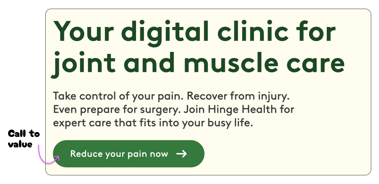
Instead of asking for action, you can invite value into the prospect’s life. You do this by showing the value of your product and the outcome it provides.
Instead of “Start Now” it’s “Reduce your pain now.” People see the value of this idea because they want to reduce their pain now.

4. Use Different Kinds of Social Proof
When prospects visit any kind of landing page, they want proof of your claim.
Lyra offers life-changing care, and it backs it up with specific numbers and case studies. It’s proof that what they do works.

5. Short and Sweet Benefits
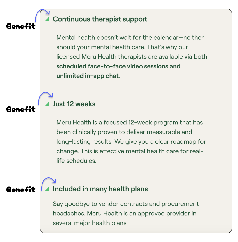
Short and sweet bullet benefits give the prospect instant information.
In the example below, prospects don’t need to read the description below the bullet if they don’t want to. They see the benefits and can scan the information.
This is what the best landing pages do — make the information scannable and valuable.

Every Niche Has Unique Landing Pages
The more I study and work with healthcare companies, the more I realize how unique the messaging is from any other niche.
You can’t write a private practice healthcare landing page and expect the same lingo as a CPG one.
You have to know the audience. Know the value of your specific brand. And know how to connect your product to your audience.