150 copywriting examples.
Before and after.
Real homepage rewrites, email teardowns, and landing page fixes for B2B companies. Every example shows exactly what changed and why it works.
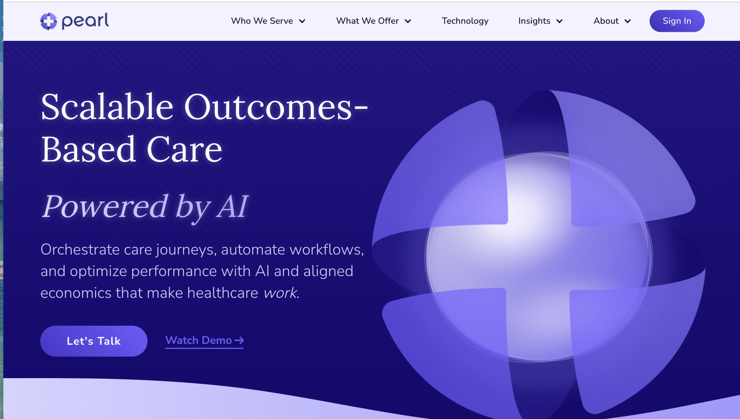
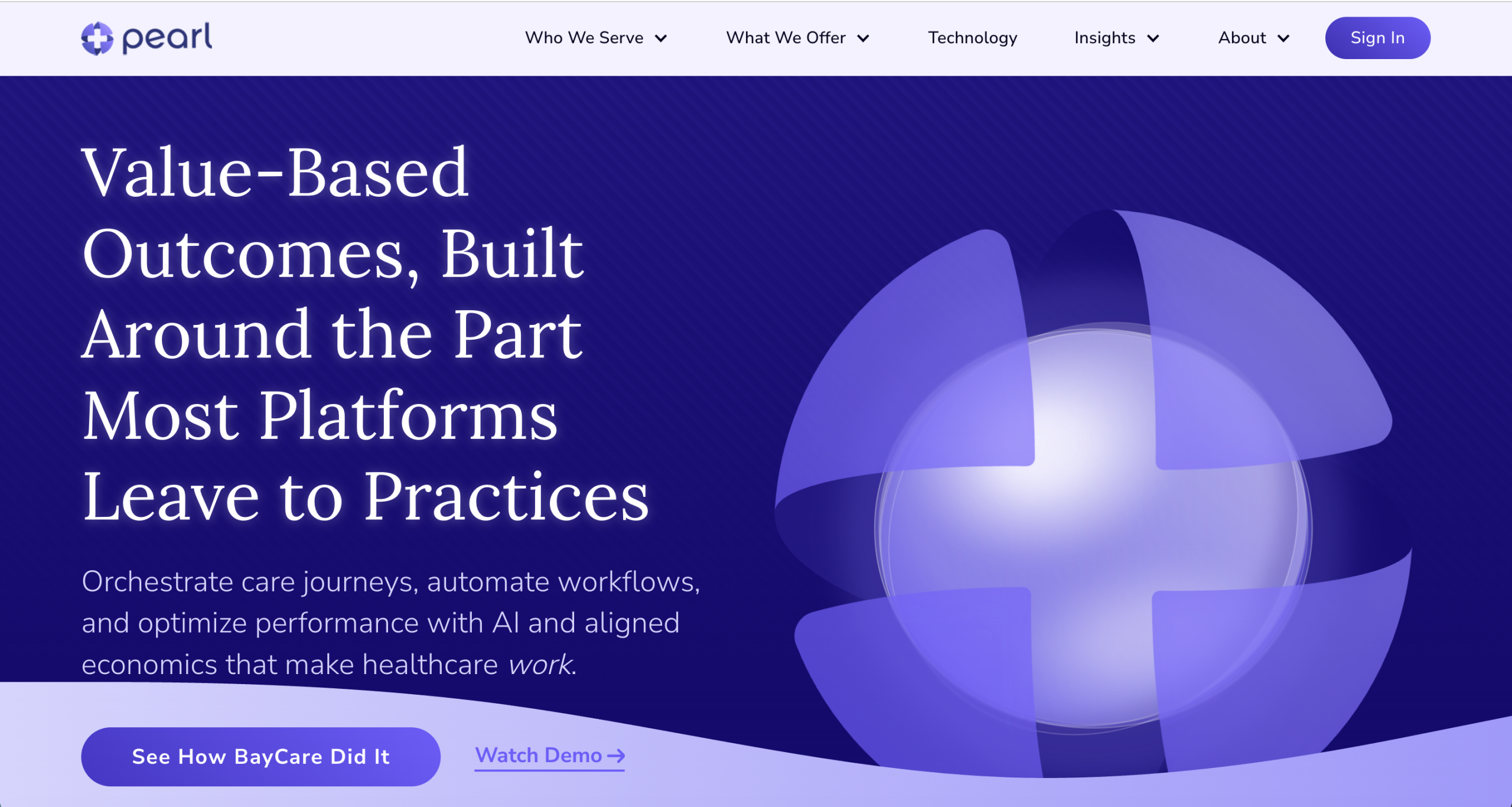
Generic category headline that could belong to any value-based care company. No differentiation, no specificity, no reason to keep reading.
Replaced the category label with a specific, outcome-driven headline that tells the reader exactly what Pearl Health does differently. And why it matters to them.
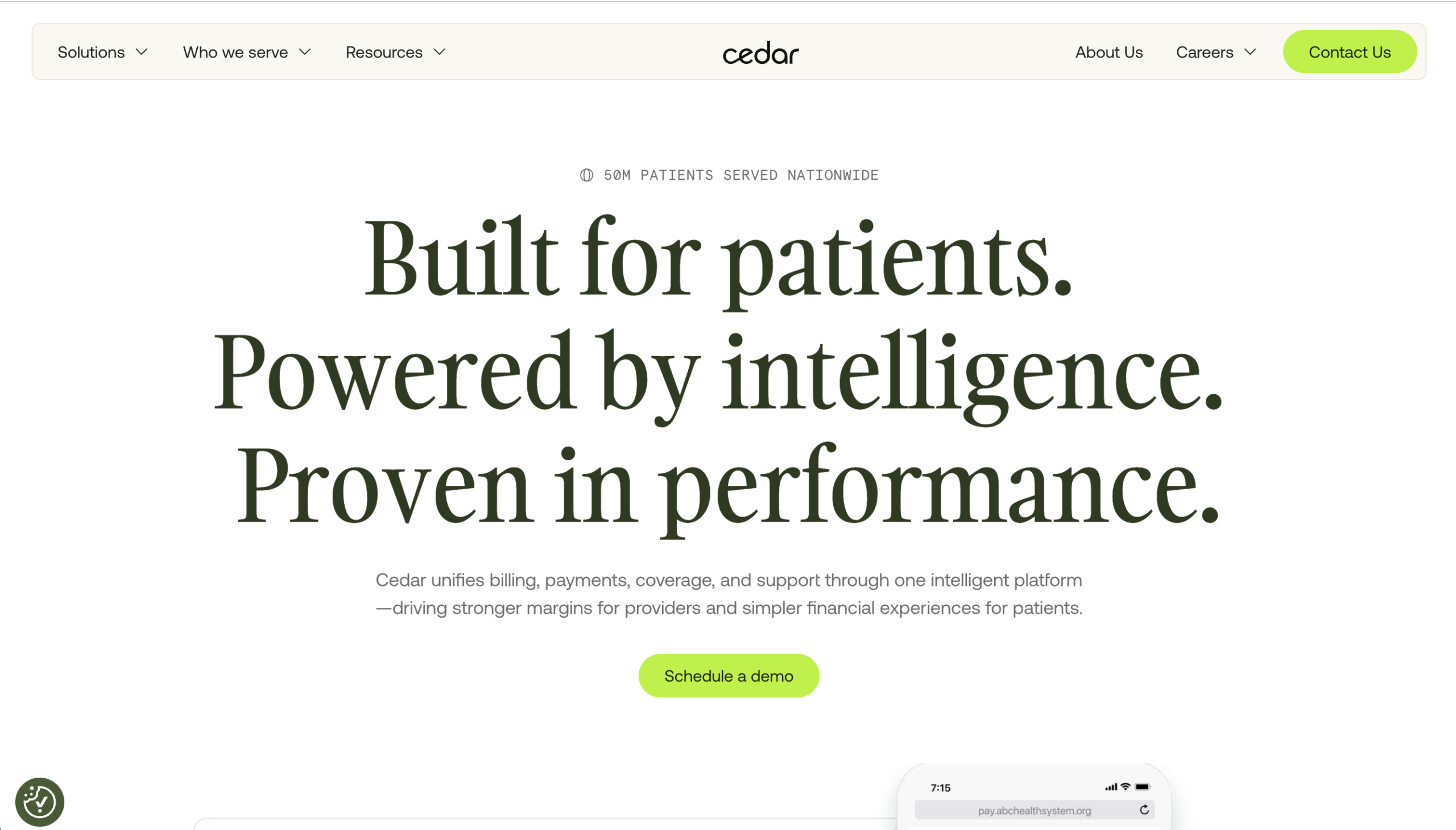
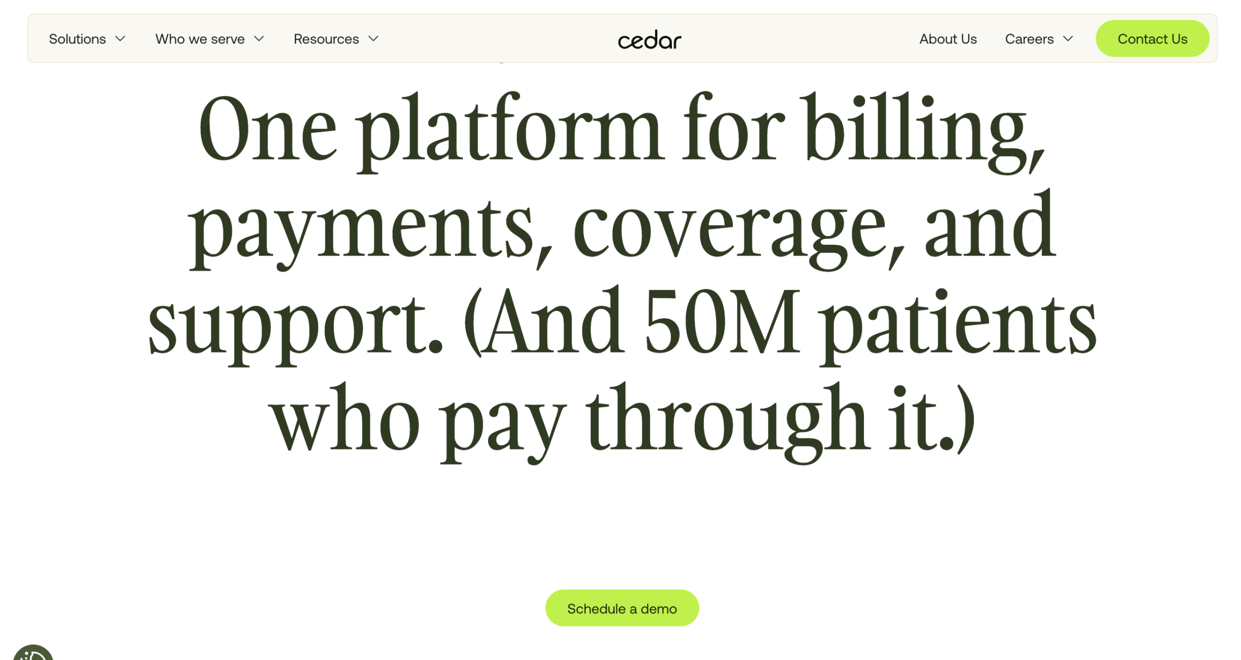
Vague, feel-good headline about "patient financial engagement" that tells buyers nothing about what makes Cedar different from every other patient billing platform.
Swapped the category description for a specific, proof-loaded claim that immediately separates Cedar from competitors and gives buyers a reason to care.
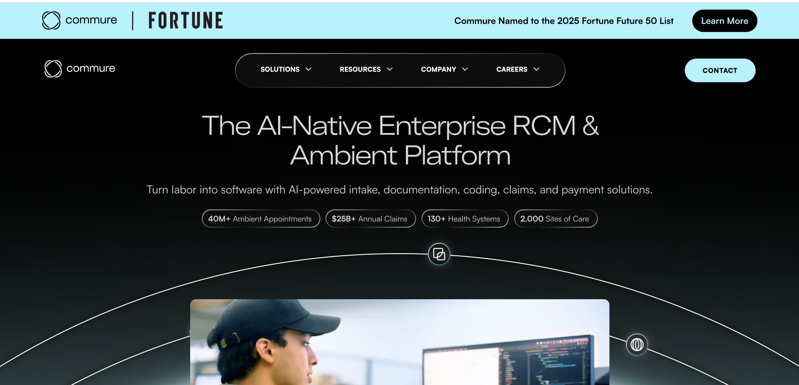
Jargon-heavy category label. "AI-Native Enterprise RCM & Ambient Platform" is a feature list masquerading as a headline. It describes what Commure built, not what it does for the buyer.
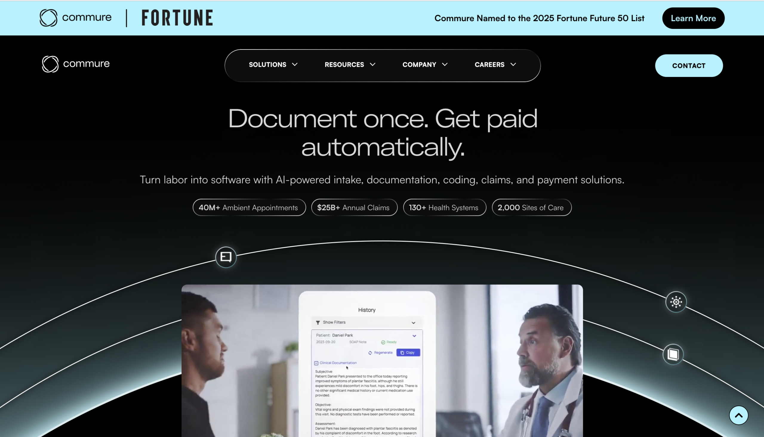
Replaced the category label with an outcome the buyer actually wants. "Document once. Get paid automatically." Six words that make the value immediately clear.
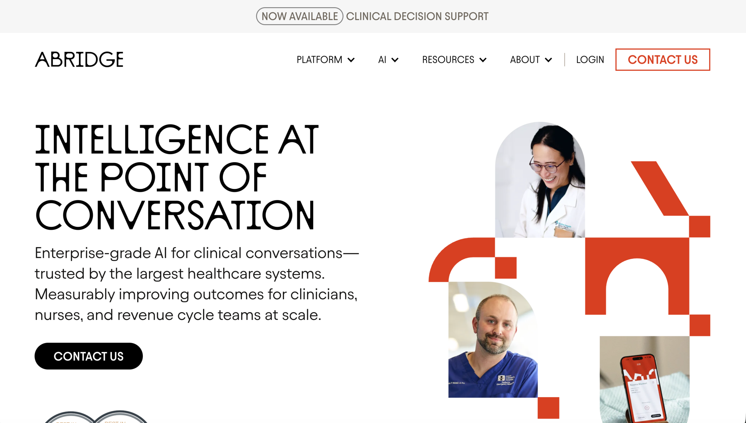
"Intelligence at the Point of Conversation" is abstract and interchangeable. Every ambient AI company could claim this. There's no competitive wedge, no proof, no reason to pick Abridge over anyone else.
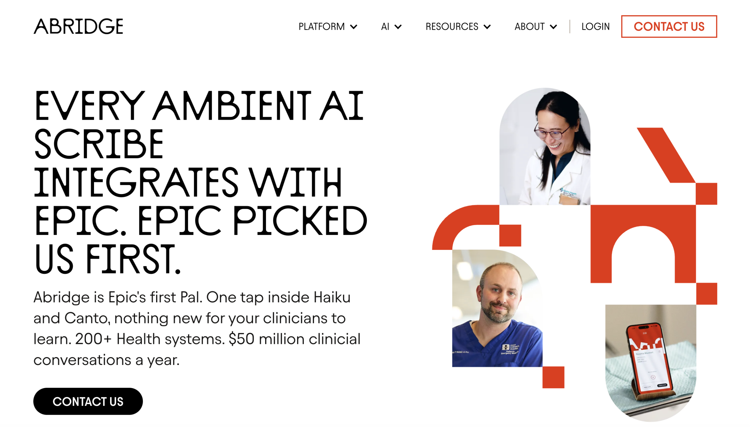
Planted a competitive wedge. "Every Ambient AI Scribe Integrates with Epic. Epic Picked Us First." Turns a commodity feature into a positioning advantage by claiming the relationship, not just the integration.
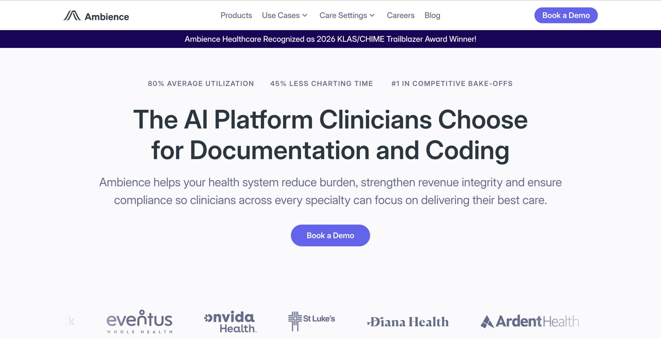
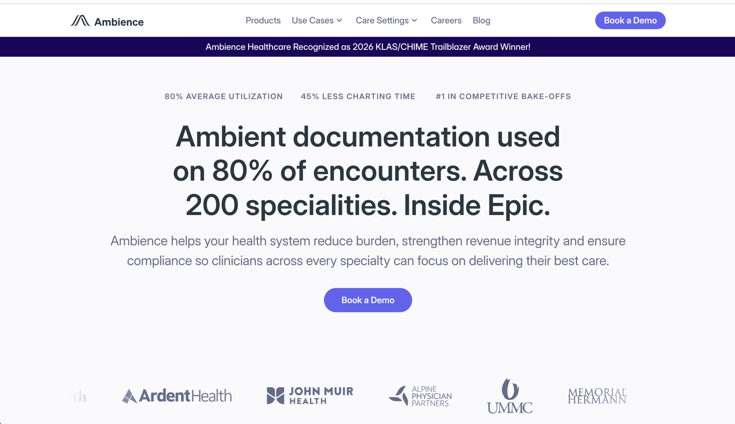
"The AI Platform Clinicians Choose" is an unsubstantiated claim. Says they're chosen but doesn't prove it. The subhead stacks every possible benefit into one bloated sentence.
Replaced the claim with the proof. "80% of encounters. 200 specialties. Inside Epic." Three specific data points that let the reader draw their own conclusion about adoption.
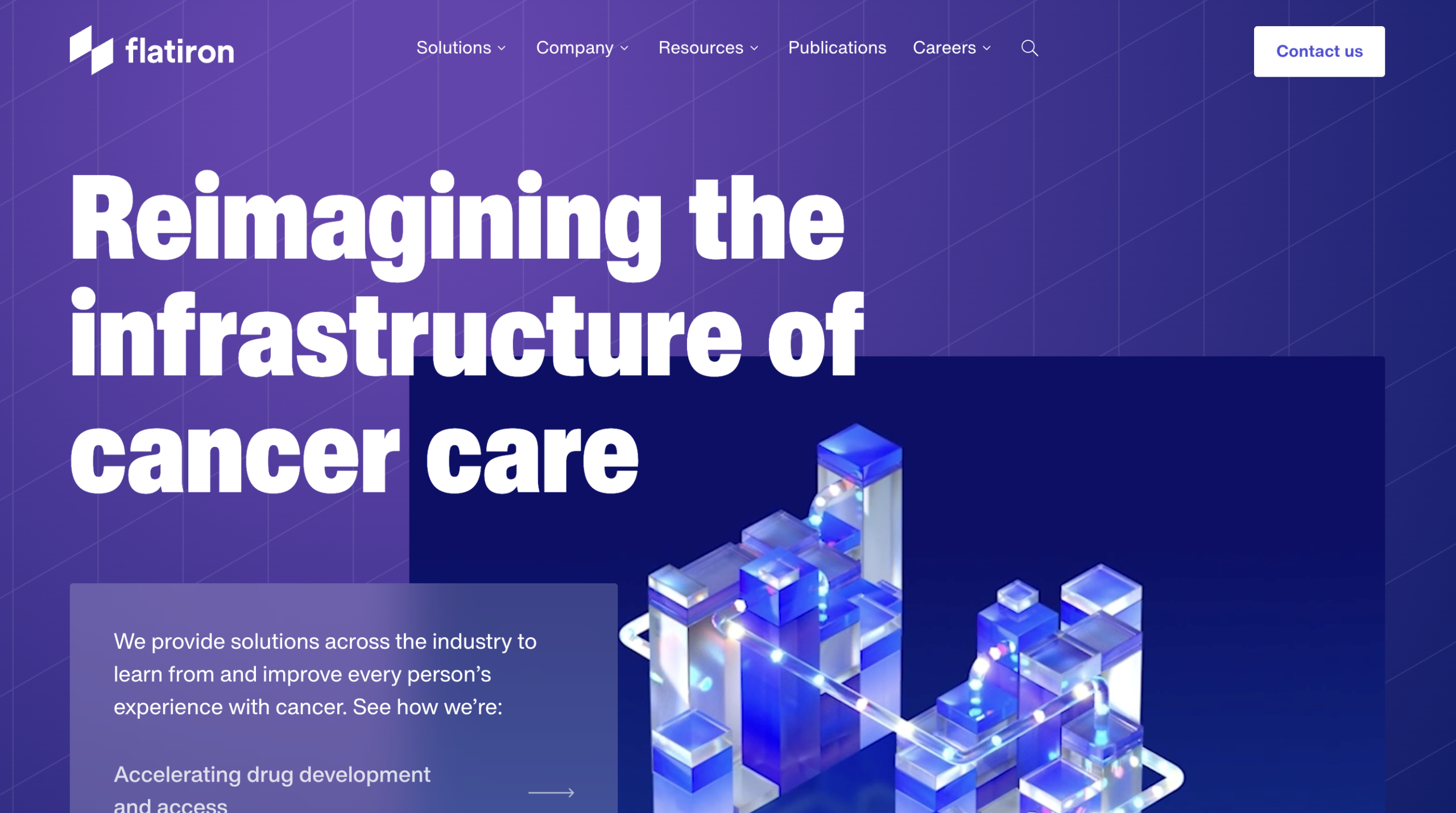
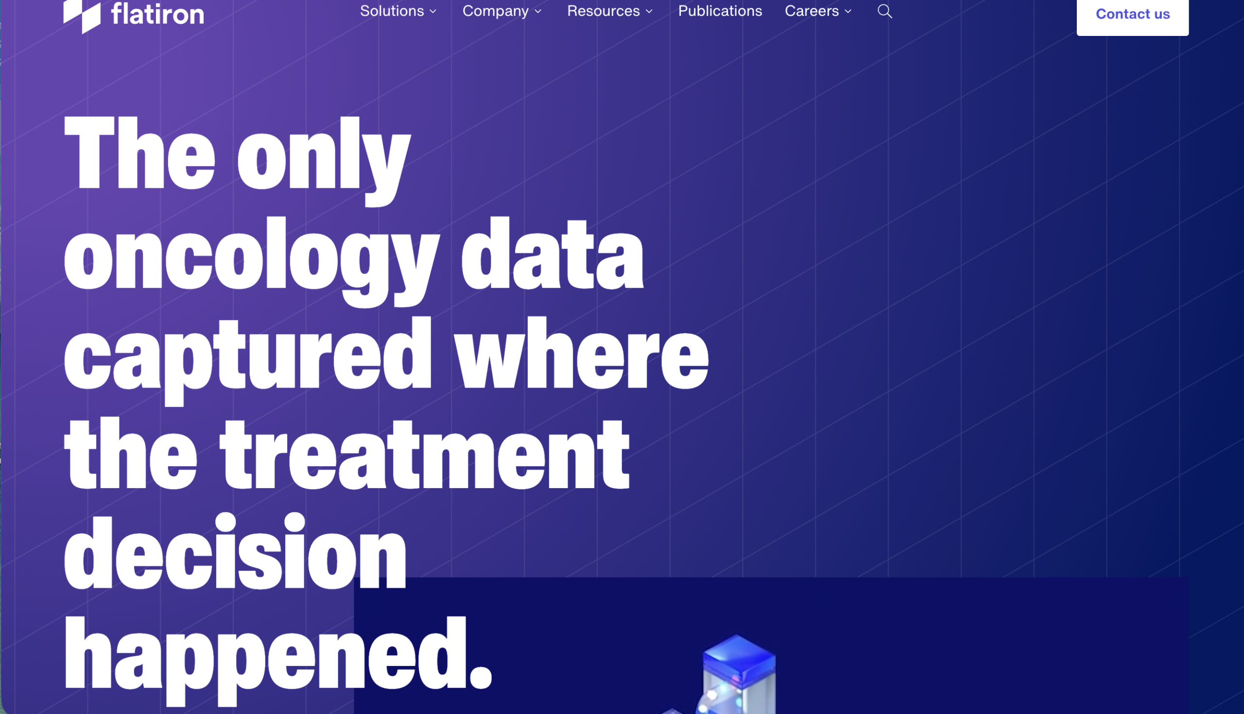
"Reimagining the infrastructure of cancer care" is aspirational but empty. It says nothing about what Flatiron actually does, what makes them different, or why anyone should care right now.
Replaced the vision statement with a specific, defensible claim. "The only oncology data captured where the treatment decision happened." Stakes a position competitors can't easily take.
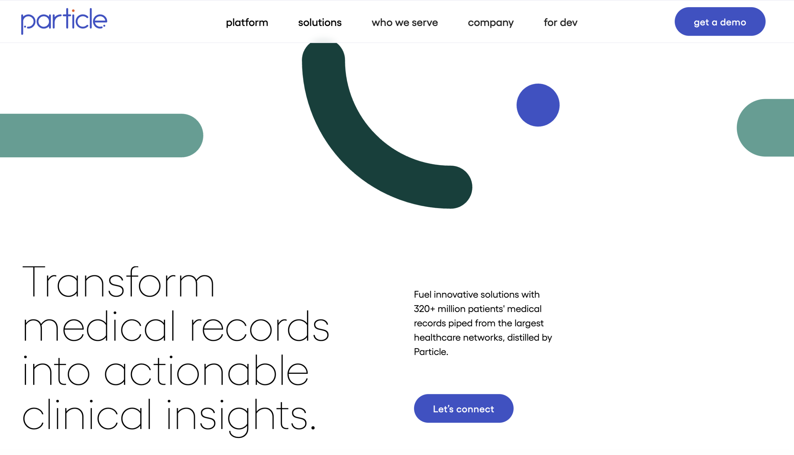
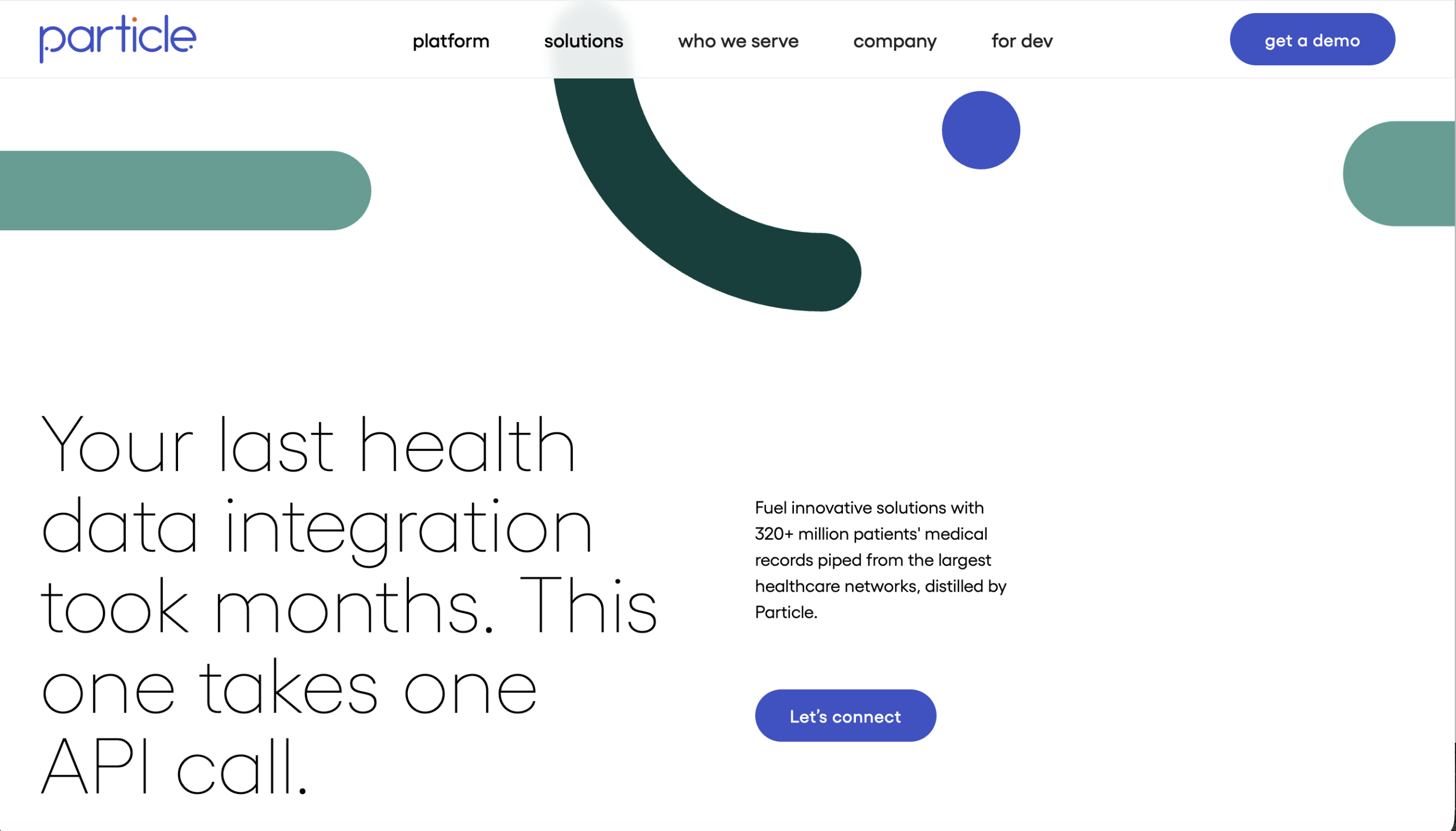
"Transform medical records into actionable clinical insights" is a feature statement anyone in health data could use. No pain, no tension, no specificity about what makes Particle different.
Led with the pain. "Your last health data integration took months. This one takes one API call." Names the exact frustration buyers have, then positions Particle as the obvious fix.
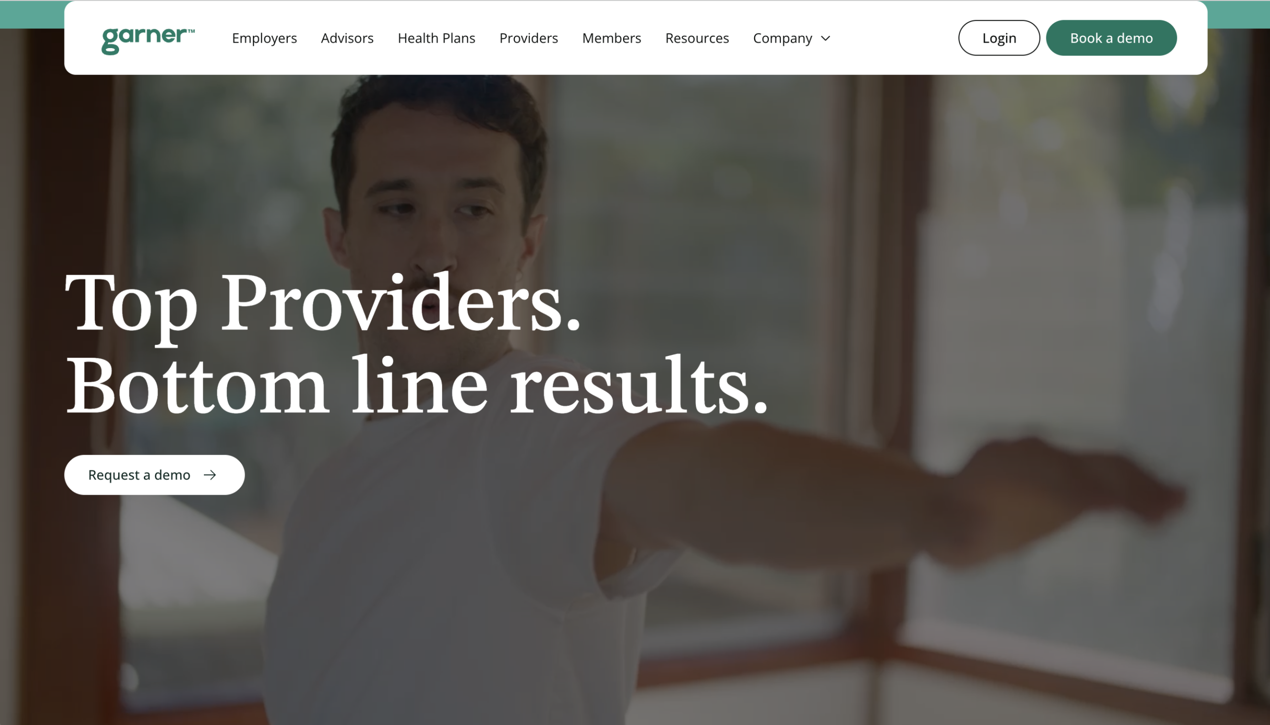
"Top Providers. Bottom line results." is a polished tagline that says nothing specific. It sounds like a billboard, not a homepage. No tension, no story, no insight.
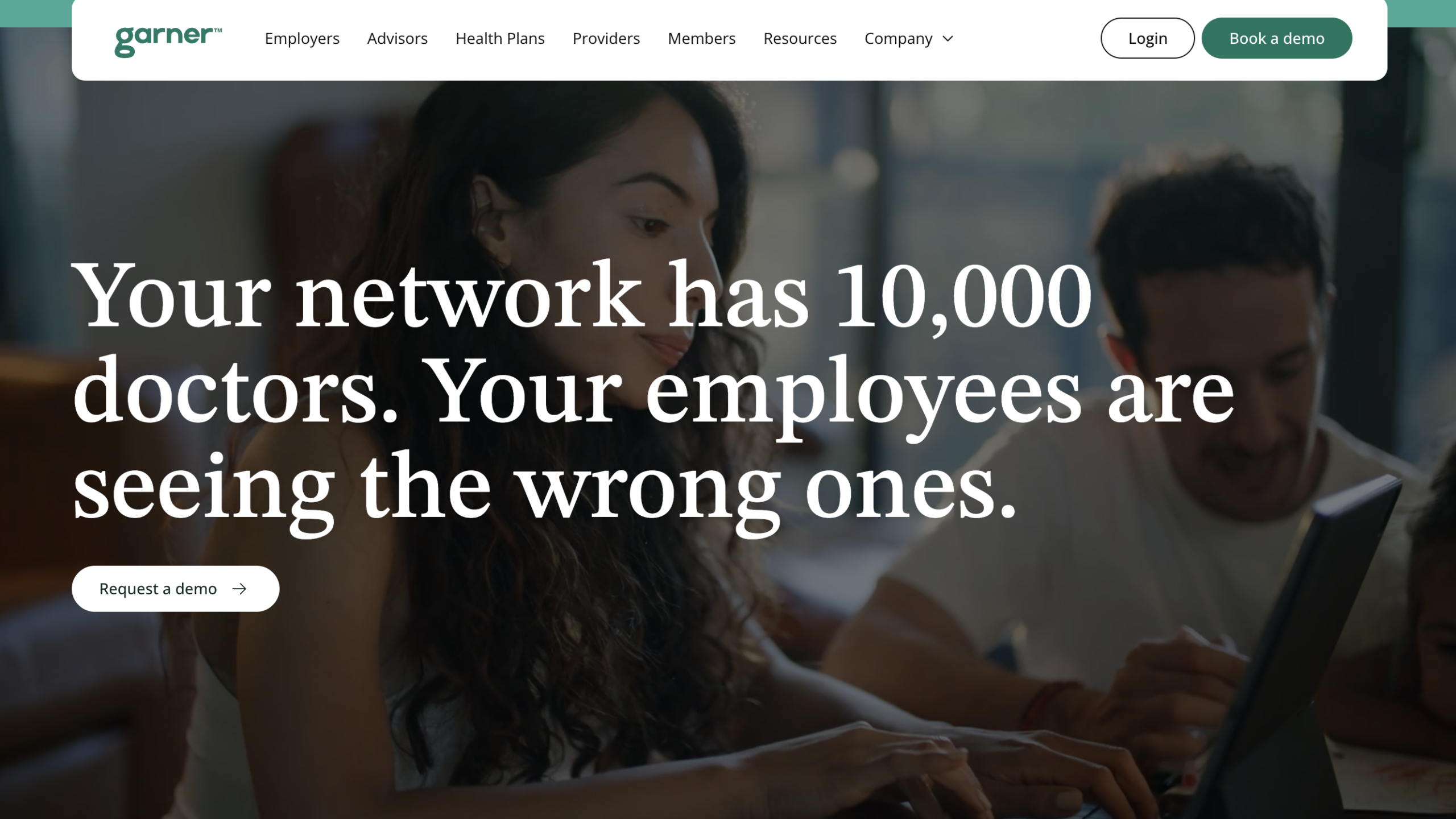
Created tension. "Your network has 10,000 doctors. Your employees are seeing the wrong ones." Names a problem the buyer already suspects but hasn't articulated, then makes it impossible to ignore.
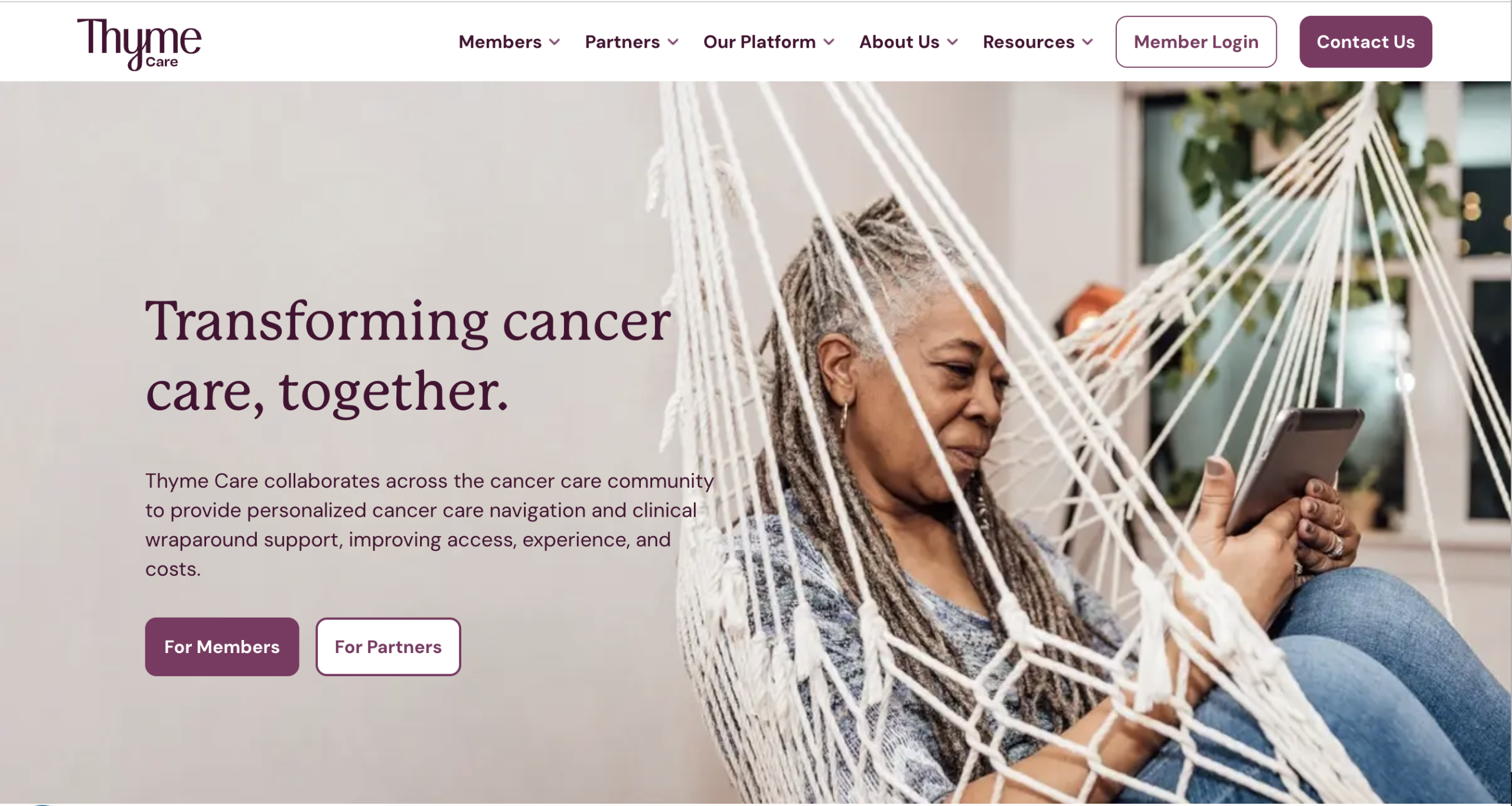
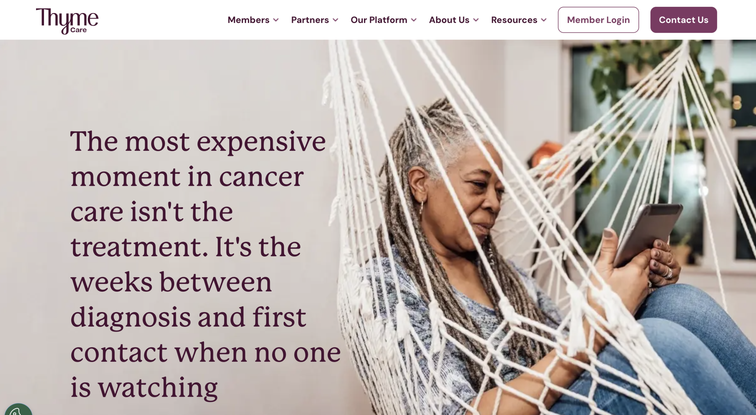
"Transforming cancer care, together" is warm but weightless. It's a mission statement, not a headline. No specificity, no insight, nothing that stops a VP of Oncology mid-scroll.
Led with an emotional insight. "The most expensive moment in cancer care isn't the treatment. It's the weeks between diagnosis and first contact when no one is watching." Reframes the problem in a way the buyer hasn't considered.
"AI-Powered Healthcare Automation" is a category label, not a headline. Every RPA vendor in healthcare says the same thing. No specificity, no proof, no wedge.
Led with a specific contrast the buyer can feel. 400 vs 400 per hour makes the value concrete. Then names the emotional cost (burnout) alongside the operational one (delays).
"The care you've always deserved" is warm but generic. Every DTC health brand could claim this. The subhead ("Start your weight loss today") is narrow and misses the breadth of what Hims actually offers.
Named the thing the buyer actually wants: not "wellness solutions" but the prescription. Without the overhead. The headline becomes a compressed story with a clear before/after.
Leading with a laundry list of conditions ("weight loss, better sex, fuller hair, improved skin") sounds like a late night infomercial. It tries to claim everything and ends up feeling generic. No focus, no differentiation from dozens of competing telehealth platforms.
Started with the reader's lived experience (failed dieting attempts), then reframed the product as science, not another program. The contrast between "willpower" and "biology" does the selling.
"Your ally in the race against cancer" is emotional but vague. Every diagnostics company wants to be an ally. "Transform uncertainty into clarity" is a tagline, not a value proposition. Nothing here tells a clinician what Veracyte actually does differently.
Dramatized the real clinical moment. The headline creates tension (waiting for biopsy results) and resolves it with the product's actual capability. The subhead reframes the value as fewer procedures, not more data.
"AI-enabled precision medicine" is a three-word category label. The subhead tries to do too much, listing four capabilities (discovery, prediction, trials, diagnosis) without proving any of them. No specificity about what makes Tempus different.
Led with the data asset (200M records), then connected it to a specific clinical moment: "your next patient." The headline becomes proof of scale and relevance in one sentence.
I wanted to reach out to introduce Waystar's revenue cycle management platform. We help health systems simplify payments, reduce denials, and improve financial performance.
Would you have 15 minutes this week to learn more?
After Cigna's prior auth policy update in Q1, health systems running manual workflows saw denial rates spike 18%.
Curious if [Health System] felt that, or if your team caught it before it hit AR.
A template cold email. "Simplify Your Revenue Cycle" is a subject line every RCM vendor sends. The body introduces the company instead of addressing the buyer's world. No reason to reply.
Anchored to a specific, real-world event (Cigna policy change). The subject line feels like intel, not a pitch. The close invites a reply without asking for a meeting. The sender sounds like a peer, not a rep.
"Complete benefits and real monthly savings" sounds like every Medicare mailer. "Ready to explore options near you?" is a weak question that reads like a search ad, not a homepage. Nothing here differentiates Devoted from any other MA plan.
Made "care" tangible. "Calls you back on the first ring" is something a member can picture and verify. The subhead turns a frustrated universal experience (hold times) into a brand differentiator.
"The AI Platform purpose-built for healthcare" is a category claim every health tech company makes. "Eliminate manual work" is generic. Listing four areas (Access, RCM, Care Ops) dilutes the message for all of them. Zero proof, zero specificity.
Replaced the generic headline with a customer result (82%, 6 weeks). The subhead promises a customized demo tied to their actual EHR. Which makes the form feel worth filling out.
"This is the face of better outcomes" is abstract and emotional without grounding. "Closes the gaps between patients, clinicians, and life-saving treatments" is a broad promise without specificity. Nothing here tells the reader what Viz.ai actually does in a clinical moment.
Placed the reader inside a clinical scenario. The headline is a story: stroke patient arrives, neurologist already knows. The time element (6 minutes) makes the AI's impact visceral and measurable.
Managing employee benefits is more complex than ever. Here are three strategies that leading employers use to improve their benefits programs:
1. Consolidate point solutions
2. Leverage data analytics
3. Improve member engagement
Want to learn how Collective Health can help?
Last quarter, a 6,000-person employer found $4.2M in wasted benefits spend. Not from fraud, but from three navigation tools that overlapped by 40%.
Their VP of Total Rewards didn't know until they mapped it.
Is that a conversation worth 15 minutes?
A "3 ways" listicle email that reads like a blog post digest. The tips are generic. The CTA is vague. Nothing in this email makes the reader think "this person understands my situation."
One story, one number, one question. The $4.2M finding is specific enough to feel real. The close doesn't ask for a demo. It asks if the conversation is worth having. Lower friction, higher reply rate.
"The Agentic Cloud for Healthcare" is a self-assigned category built on a buzzy AI term. The subhead stacks three workflow types and three outcomes without proving any of them. "Faster growth, lower costs, and better outcomes" is the most generic promise in healthcare SaaS.
Named the pain (14 systems) and the promise (act like one). The number 14 feels real. Buyers nod because their own number might be 12 or 18. The subhead lists specific data sources, not buzzwords.
"Make the Invisible Visible" is catchy but abstract. The subhead tries to do too much: naming the product (Meridian), quoting a dollar range ($50-85M), and listing benefits (quality, financial performance, payment models) all in one sentence. Listing three buyer types dilutes the message for all of them.
Made analytics tangible by showing a specific use case: find the expensive outliers in your network. "In one query" adds speed. The 12%/40% ratio creates instant tension between a small group and a large cost.
Zocdoc helps practices like yours attract new patients and fill open appointment slots. Our platform reaches millions of patients searching for care online.
Ready to see how Zocdoc can help grow your practice?
Your schedule shows 23 unfilled appointments this week. The dermatology practice two blocks from you has 3.
The difference isn't demand. It's discoverability.
Happy to show you their Zocdoc setup. Takes 10 minutes.
"Grow Your Practice" is what every healthcare marketing vendor says. The email talks about Zocdoc's platform instead of the doctor's problem. "Millions of patients" is a vanity metric that doesn't connect to their empty slots.
Used specific data about THEIR practice (23 open slots) and created peer comparison tension (nearby practice has 3). Then reframed the gap as solvable: not a demand problem, a discoverability one. The CTA offers a peek at the competitor's setup. Irresistible.
"Lower costs. Happier, healthier employees." stacks three claims without proving any of them. "Flexible suite of healthcare navigation solutions" is corporate jargon. "Right care at the right time" is a phrase used by every navigation company in the industry.
Built a micro-narrative in the headline. Phone tree vs. Nurse is a contrast every benefits leader has lived. The headline doesn't describe the product. It dramatizes the experience gap.
"The most comprehensive mental health benefit" is a superlative claim every competitor disputes. "Boosts employee well-being and drives business impact" tries to serve two audiences in one sentence and ends up being vague for both. No proof, no specificity.
Used a single devastating comparison: 3% vs 15% utilization. Benefits leaders know their EAP utilization is embarrassingly low. This headline names the gap and implies Lyra closes it. Without saying "we're better."
Nomi Health helps self-insured employers reduce costs by connecting directly with providers, eliminating middlemen in the healthcare supply chain.
We'd love to show you how direct contracting can save your organization up to 30% on healthcare spend. Would you have time for a quick call?
Ran the math on a 4,000-life employer in [State]. Between network access fees, PBM spread, and repricing markups, the total intermediary load was 38% of paid claims.
That's not a margin. That's a second healthcare budget.
Worth comparing to what [Company] is paying?
"Cut Healthcare Costs with Direct Contracting" is a pitch, not a conversation. "Eliminating middlemen" is Nomi's story, not the buyer's. "Up to 30%" is a vague claim that triggers skepticism, not curiosity.
Made the waste visible and specific: 38%, broken down by source. "A second healthcare budget" is a reframe that makes the problem impossible to ignore. The close asks to compare, not to buy. Lower friction, higher intrigue.
"Live healthier. Feel better." is a greeting card, not a value proposition. "Personalized support to get to a healthier you" could describe any wellness app. Nothing here creates urgency or differentiates from a dozen competing platforms.
Created urgency by naming the ticking clock benefits leaders already feel. "Not sick yet. But they will be" is a line that sticks. The subhead reinforces early intervention without using the clinical jargon.
"AI-native solutions that make healthcare simpler" is a generic claim every EHR vendor makes with "AI" swapped in. The subhead stacks three promises (relieves burden, achieves goals, frees clinicians) without proving any of them. "Simpler" is vague.
Named the pain practice managers actually feel: needing IT staff to run their EHR. The headline creates a contrast between how things are and how they should be. The subhead delivers proof in three short phrases.
Doximity is the leading digital platform for physicians, with over 80% of U.S. Doctors as members. Our advertising solutions help pharma and medical device companies reach their target HCPs with precision.
Let's schedule a call to discuss how we can support your next campaign.
Your last HCP campaign reached physicians in their inbox. Problem is, 70% of physician email goes unread.
On Doximity, cardiologists spend 14 minutes per session. That's not a scroll. That's attention.
Curious what a campaign looks like when physicians are actually looking at the screen.
Opens with a self-congratulatory stat (80% of U.S. Doctors) and immediately pitches. The email is about Doximity, not about the buyer's campaign problem. "Let's schedule a call" is a dead-end CTA.
Led with the buyer's channel problem (unread physician email), then positioned Doximity as the attention alternative. "14 minutes per session" proves engagement. The close sells curiosity, not a meeting.
"We Do Well, Together." is a vague tagline that could belong to any company in any industry. "Elevates the patient-provider relationship" is consultant-speak that doesn't resonate with a physician-owner worried about survival.
Named the existential threat (independent practices disappearing) and positioned Privia as the alternative to acquisition. The subhead is the value prop in one line: system-level resources, independent ownership.
"Designed to treat you better" is vague and self-referential. Better than what? The subheadline doubles down with "It's all Included," a pun on the company name. No proof, no pain, no urgency. Nothing tells an employer why they should switch from their current benefits navigator.
Led with a shocking stat that benefits leaders can verify against their own claims data. 30% unnecessary surgeries is both a cost problem and a care quality problem. And the solution feels obvious once you see the gap.
"Healthcare software that integrates care, billing, and operations" is a feature list masquerading as a headline. "One seamless ecosystem" is jargon. "Exceptional care" is an empty promise without connecting to what a SNF administrator actually worries about.
Asked a question every SNF administrator knows the answer to (and dreads). The medication list gap is a real patient safety issue and a regulatory liability. The headline makes the problem vivid, the subhead makes the solution clear.
Signify Health's network of clinicians conducts comprehensive in-home health evaluations that capture accurate diagnosis data to improve risk adjustment accuracy.
Let's discuss how our HRA program can support [Health Plan]'s quality and revenue goals.
A mid-size MA plan in [State] ran their first round of in-home evaluations last year. They found 2.3 net-new HCCs per member on average.
That's not a coding problem. It's revenue you've already earned but haven't captured.
Curious if [Health Plan] has quantified that gap.
"Improve RAF Scores" is a feature pitch disguised as a subject line. The email describes the service instead of naming the buyer's problem. "Quality and revenue goals" is generic corporate language.
Reframed the problem as missing revenue, not missing data. "2.3 net-new HCCs per member" is specific enough to trigger a CFO's curiosity. The close asks if they've quantified the gap. a question that creates internal urgency.
"Activated patients. Improved outcomes." is a tagline that sounds like a press release. "Supports patients in taking a more active role in their care" is vague. No numbers, no proof, no emotional connection to the daily pain of running a practice.
11 minutes vs 90 seconds. The contrast makes the value visceral. Every practice manager knows the front desk bottleneck. The subhead names exactly what happens in those 90 seconds, proving it's not vaporware.
"Find the right psychiatrist for you, fast" is a search engine tagline, not a value proposition. "Quality, in-network care starts here" is generic. Neither line addresses why someone desperate for mental healthcare should pick Talkiatry over other options.
Named the exact frustration (3-month wait for in-network psychiatry). Every person who's tried to find a psychiatrist knows this pain. The headline validates the frustration, then the subhead resolves it in concrete terms.
"Improvements You Can Measure. Outcomes That Matter." is a tagline built on empty adjectives. Every analytics vendor claims measurable improvements. "We start with your goals" is consultant-speak. Nothing here tells a health system what Health Catalyst actually does differently.
Named the real frustration: health systems have mountains of data but can't use it. "Ask it questions" is simple, human language. The subhead adds urgency with "this quarter". Not someday, not eventually.
Veeva provides cloud software for the life sciences industry, helping companies bring therapies to market faster while maintaining regulatory compliance.
I'd love to show you how our platform can streamline your clinical, regulatory, and commercial operations. Do you have 30 minutes this week?
A mid-size biotech nearly missed their FDA submission window because their eTMF was split across SharePoint, Box, and a shared drive no one maintained.
Not a tech problem. A single-source-of-truth problem.
Is [Company]'s trial documentation in one place, or many?
"Modernize Your Life Sciences Operations" is a pitch no one asked for. The email talks about Veeva's platform instead of the buyer's pain. Asking for 30 minutes from a stranger with no hook is a non-starter.
Told a story about a near-miss that regulatory affairs leaders fear. Named the actual tools (SharePoint, Box, shared drives) they're currently using. The close asks a diagnostic question, not for a meeting.
"Care for cancer. Reinvented." is dramatic but vague. "Access. Speed. Direct clinical care." is a list of single-word claims without proof. Nothing here tells you what Color actually does differently or why their approach to cancer care is reinvented.
Created a two-part headline where the second half reframes the first. Screening catches cancer early. Everyone knows that. But finding who's NOT getting screened is the harder, more valuable problem. That's Color's thesis, stated simply.
"Artificial intelligence to heal our world" is grandiose and disconnected from the buyer's problem. Listing four categories (MSK, women's health, cardiometabolic, mental health) dilutes each one. The headline talks about Sword's mission instead of the buyer's cost problem.
Put a dollar amount on the pain ($9,000 per claim) and a clear verdict (most are avoidable). Benefits leaders know MSK is their #1 or #2 cost category. The headline makes the problem personal, the subhead makes the solution feel like prevention, not another point solution.
It was great meeting you at our booth at HIMSS. As discussed, Carta Healthcare uses AI to automate clinical registry abstraction, reducing manual chart review time by up to 80%.
I'd love to schedule a follow-up demo. When works best for you?
You mentioned your quality team is 3 months behind on STS registry submissions. That tracks. Most cardiac programs we talk to are running 2 to 4 months behind right now.
We put together a quick analysis of what that gap looks like in CMS star ratings impact. Worth a look?
"Great Connecting at HIMSS!" is the subject line of 400 emails the buyer received that week. The body restates the product pitch instead of referencing anything specific from the conversation. Generic follow-up, generic result.
Referenced a specific detail from the conversation (abstraction backlog). Normalized the problem (most programs are behind). Then offered a tangible deliverable (CMS star ratings analysis) instead of a demo. The buyer gets value before committing time.
"Get the care you deserve" is a generic tagline used by dozens of healthcare companies. The subhead is conversational but vague. "Exists to fill gaps" doesn't tell a health plan partner what Cityblock actually does or why it's different.
Reframed the problem: it's not about coverage, it's about presence. "Someone who shows up" is visceral and true. The headline connects the health plan's cost problem to the member's access problem in one sentence.
"Ask Any Question About Healthcare" is broad to the point of meaninglessness. Any question? Really? "Get an Answer You Can Use" is the bare minimum promise of any analytics tool. Nothing here tells you what Komodo actually does or why their data asset is different from every other healthcare data company.
Made the data asset solve a specific, high-stakes problem: finding rare disease patients for a therapy launch. "8,000 patients" makes the scale feel human. The subhead connects the 330M number to a competitive advantage. Not just data, but speed to market.
"Transcarent is the One Place for Health and Care" puts the company name in the headline, wasting space. "WayFinding" is a branded product name that means nothing to prospects. "One experience people love to use" is an unproven claim. No tension, no specificity, no proof.
Made the fragmentation problem concrete: 7 apps, zero usage. Benefits leaders know this is true because they see the utilization reports. The subhead names each app being replaced. Which validates the problem and previews the solution simultaneously.
"A Clinical-First, AI-Native EHR That Saves You Time" stacks three modifiers (clinical-first, AI-native, time-saving) without proving any of them. The subhead tries to serve every practice size at once and ends up saying nothing to anyone.
Named the daily pain every PCP feels: charting after hours. "10pm" is visceral and specific. Any physician who spends evenings finishing notes sees themselves in this headline and immediately wants to know how.
Glooko's remote monitoring platform helps diabetes care teams track patient glucose data from 95% of devices on the market, enabling better clinical decisions and improved outcomes.
Can we schedule 15 minutes to discuss how Glooko can support your diabetes program?
Talked to a diabetes center in [State] last month. Their endocrinologists were spending 8 minutes per patient downloading and printing CGM reports before each visit.
Now it's automatic. Every device, every patient, one dashboard, pre-visit.
Is that a workflow your team has solved, or is it still manual?
"Better Diabetes Management" is a category label subject line. The email pitches device compatibility (95%) as if that's what the buyer cares about most. It's a spec sheet, not a conversation.
Named the specific daily annoyance (downloading CGM data one patient at a time). "8 minutes per patient" makes the waste tangible. The close asks a diagnostic question. If they've solved it, no harm; if they haven't, the next step is obvious.
"Healthcare Cybersecurity" is a two-word category label, not a headline. It tells a hospital CISO absolutely nothing about what Claroty does differently or why they should care. The subhead stacks three generic promises without specificity. No tension, no reason to act now.
Asked a question the CISO can't confidently answer (how many devices can you see?). 10,000+ makes the scale feel real. Naming specific devices (IV pump, MRI, ventilator) grounds the abstract "connected devices" in clinical reality.
"AI-powered innovations for a healthier tomorrow" is a tagline that says nothing specific. "More effective, inclusive, and sustainable healthcare system" stacks three adjectives no buyer Googled. Zero differentiation from any competitor in the space.
Painted a scene every home health director knows: clinicians finishing notes in their cars after visits. "In the parking lot after" is specific enough to make someone wince. The headline names the operational debt; the subhead resolves it.
Caris Life Sciences offers the most comprehensive molecular profiling services in oncology, analyzing DNA, RNA, and proteins to identify the full range of therapeutic options for your patients.
Request an informational kit to learn more about how our testing can inform your treatment decisions.
Standard NGS panels test ~300 genes. They miss fusion events, splice variants, and protein expression changes that affect treatment selection in 22% of advanced solid tumors.
That's one in five patients where the panel says "no actionable findings". But there are findings. Just not where the panel was looking.
Worth comparing against what [Cancer Center] is currently running?
"Comprehensive Molecular Profiling" is what every genomics lab claims. "DNA, RNA, and proteins" is a technology list, not a clinical insight. "Request an informational kit" is a 1990s CTA.
Named the gap in the oncologist's current workflow: their panel is missing findings in 22% of patients. "No actionable findings" is a phrase oncologists see on reports and accept. This email challenges that acceptance with data, not marketing claims.
"Health insurance made for real life" is a tagline every insurer wishes they could claim. "We're your healthcare partner" is an empty relationship claim. Nothing here tells a consumer what Oscar does differently in their actual healthcare experience.
Named a universal frustration (confusing medical bills) with a line that makes people nod. The subhead turns "easy" into three specific, verifiable things: cost transparency, a dedicated doctor, and phone support that works.
"Connecting the Continuum of Care" is the most overused phrase in healthcare B2B. Listing three customer types dilutes the message. "Coordinate patient transitions" is what every case management tool claims.
Told a specific story every discharge planner and CMO recognizes: the patient left, and the hospital lost visibility. "Filled the prescription" is a concrete, relatable example of post-discharge risk. The 30-day window adds financial urgency.
Arcadia's data platform aggregates, cleanses, and enriches healthcare data from diverse sources, empowering organizations to drive performance in value-based care arrangements.
Download our latest whitepaper to learn how leading health systems are leveraging data analytics for VBC success.
Most ACOs have at least one shared savings contract where they're losing money and don't know exactly why. The data exists across 4 systems and nobody's reconciled it.
We built a 15-minute analysis that maps your claims, clinical, and quality data into one view. Usually surfaces a specific gap within the first 5 minutes.
Want me to run it on [Organization]'s data?
"Unlock the Power of Your Healthcare Data" is a cliche. "Aggregates, cleanses, and enriches" describes the plumbing, not the outcome. Offering a whitepaper download assumes the buyer has time and interest in thought leadership.
Asked a question that creates internal urgency: which contract is underwater? Instead of a whitepaper, offered a 15-minute analysis that delivers actual value. "Surfaces a specific gap in 5 minutes" is a testable promise that earns the meeting.
"Pain relief for every body" is a consumer tagline that doesn't speak to the employer buyer. "Get back to the things you love" is wellness copy. The subhead lists features (virtual PT, care team) without connecting them to the employer's cost problem. Same message as every MSK vendor.
Led with a startling statistic (62% surgery failure rate) that reframes the entire category. If most surgeries don't work, prevention isn't a nice-to-have. It's the rational choice. The headline makes the case for the entire category shift, not just for Hinge Health.
"Empowering Providers and Their Patients to Achieve Better Health" is a mission statement, not a value prop. "Optimize medication management" is vague. "Every step of the patient journey" is a cliche. No proof, no specificity about what DrFirst does differently.
Told a micro-story that every CMIO and pharmacist recognizes: duplicate prescribing under different drug names. It's a daily occurrence with real patient safety consequences. The headline makes the risk visceral; the subhead shows how the product catches it.
Availity's real-time data exchange platform simplifies administrative and clinical workflows between payers and providers, reducing friction and improving operational efficiency.
We'd love to show you how we can help [Organization] reduce administrative costs. When are you free for a demo?
Talked to a 200-physician group last week. Their billing team was spending 22 hours a week on manual eligibility verification. Calling payers, waiting on hold, re-keying data.
They automated it. Went from 22 hours to 45 minutes.
Is that a problem your team has solved, or still living with?
"Streamline Payer-Provider Collaboration" is jargon soup. "Reducing friction and improving operational efficiency" describes every B2B SaaS product ever built. No specificity, no story, no reason to reply.
Named the specific task (eligibility checks), quantified the waste (22 hours/week), and showed the outcome (45 minutes). The close asks a diagnostic question that sorts prospects: if they've solved it, fine; if they haven't, the next step is clear.
"Clinically trained AI" is a modifier every health AI company uses. "Streamline payer and provider collaboration" is abstract. The subhead is a run-on sentence stacking buzzwords (utilization management, payment integrity, efficiency, control) without proving any of them.
Created emotional urgency by naming the human cost: 14 days while a patient waits for surgery. Then showed the solution (hours, not weeks) alongside a reframe: faster doesn't mean rubber-stamping; it means better clinical review.
"Run your entire practice with one EHR+ platform" is better than most but still leads with the product format (EHR+), not the outcome. The subhead lists AI features without connecting them to what a practice owner actually cares about: seeing more patients, going home earlier, getting paid faster.
Started with the physician's identity crisis: they became a doctor to see patients, but they've become an administrator. This emotional truth drives every practice management purchase. "Practice medicine again" is a promise worth clicking for.
Contessa Health partners with health systems and payers to deliver hospital-level care in the patient's home. Our program has demonstrated reduced readmissions, lower costs, and higher patient satisfaction.
I'd love to discuss how hospital-at-home can benefit [Health System]. Do you have time for a brief call?
The math on capacity is breaking down for most health systems: occupancy is at 95%, ED boarding is up, and elective cases are getting delayed.
One system in the Southeast moved 15% of eligible admissions to hospital-at-home. Freed 50 beds. Readmissions dropped 22%.
Has [Health System] modeled what home-based acute care would do to your capacity constraints?
"Hospital-at-Home: The Future of Acute Care" sounds like a conference panel title. The email describes the program instead of naming the capacity crisis that makes it necessary. Three generic outcomes without specifics.
Named the operational crisis (340 beds full) and created a visual contrast (full hospital, empty homes). The example is specific: 15% of admissions moved, 50 beds freed, 22% readmission drop. The close asks about their capacity model. a strategic question, not a sales pitch.
"See what matters. Less noise. More focus." is abstract. It could describe any analytics product. "Turning clinical data and signals into actionable insights" is the most generic phrase in health tech. Nothing here tells a radiologist what Aidoc actually does.
Put the reader in the radiologist's chair: 200 scans, one pulmonary embolism hiding in the queue. The question "Which one?" creates instant tension. The subhead resolves it with a clear, credible description of what the AI actually does.
"The new operating model for healthcare credentialing" is a positioning statement, not a value prop. "AI operations partner" and "real-time CVO" are insider jargon. A VP of Medical Staff Affairs doesn't think in terms of operating models.
Named the exact frustration: a provider who's been on staff for months but can't bill four payers. The revenue loss is implicit but powerful. "Day one, not day ninety" compresses the value prop into a single contrast.
"Bringing the power of ultrasound into your assessment, diagnosis and treatment" is a generic description of what every ultrasound does. The subhead ("145,000+ customers") is a vanity metric without context. Nobody knows why Butterfly matters over what they already have.
Created a price-point contrast ($100K vs $2K) that makes the disruption undeniable. Each phrase gets shorter, building momentum. "No radiology department required" is the line that makes CFOs and rural clinic directors pay attention.
Wellframe's digital health management platform empowers health plan care teams to engage members more effectively through mobile-first programs that improve outcomes and reduce costs.
Download our case study to see how a leading regional plan improved member engagement by 3x.
The average care management call attempt has a 12% answer rate. That means 88% of your team's outreach goes nowhere.
One regional plan switched from phone calls to in-app messaging. Answer rate went from 12% to 68%. Same team size, 5x the engagement.
Is phone-first still the strategy at [Health Plan]?
"Digital Care Management for Health Plans" is a category descriptor. "Empowers care teams to engage members more effectively" is meaningless padding. Linking to a case study is a weak CTA. The buyer has to do work to find value.
Named the daily frustration care managers feel (calling members who don't answer). 12% vs 68% is a jaw-dropping contrast. The close asks a strategic question that implies the buyer's current approach is outdated. Without saying it.
"Power Your Hospital and Pharmacy Operations" is generic enough to describe any hospital ops vendor. "From procurement to compliance" lists two endpoints without connecting them. "Save time and boost efficiency" is the most overused promise in healthcare SaaS.
Made the risk tangible: someone snooped, and you won't know for months. Every privacy officer has lived this nightmare. The subhead escalates the consequences (investigation, headline, lawsuit) in a way that makes the solution feel urgent and necessary.
Netsmart provides comprehensive EHR, analytics, and telehealth solutions purpose-built for behavioral health and human services organizations.
We help organizations like yours improve clinical outcomes, operational efficiency, and regulatory compliance. Would you like to learn more?
Most behavioral health organizations we talk to are running clinical documentation in one EHR, billing through a separate system, and tracking outcomes in a spreadsheet.
The result: 40+ minutes of admin per clinician per day, and outcome data that's always 3 months stale.
Is that roughly what [Organization] is dealing with?
"Technology Solutions for Behavioral Health" is a category description, not a conversation starter. Listing three outcomes (clinical, operational, compliance) without proof is wallpaper. "Would you like to learn more?" is the weakest CTA in email.
Described the buyer's current reality so accurately it feels like surveillance. Three systems, admin burden quantified (40+ minutes), stale data. The close asks "is this you?". a yes/no question that's easy to reply to and hard to ignore when it's accurate.
"Unburden your staff, unblock access to care" is better than most but still abstract. "Shield your staff from repetitive calls" describes the feature, not the impact. "Stretch operational dollars" is jargon. No numbers, no specifics, no proof.
Made the inefficiency visual: 60% of calls are the same 5 questions. Every call center director knows this intuitively. The subhead names the specific call types (scheduling, refills, billing, directions). Proving Hyro knows the workflow, not just the buzzwords.
"Leader in Generative & Agentic AI Solutions" is a self-awarded title stuffed with buzzwords. Listing five areas (Translational Medicine, Clinical Trials, etc.) dilutes the message for all of them. Nothing connects to the buyer's specific pain point.
Named the exact problem every VP of Clinical Operations dreads: enrollment lagging badly. 112 out of 400 in 18 months is a specific, recognizable crisis. The subhead offers the solution with a credible data asset (6M+ records) and a concrete outcome (40% faster).
Our FDA-authorized prescription digital therapeutic provides clinically proven treatment for substance use disorders, delivering cognitive behavioral therapy through a mobile application.
I'd love to discuss how this can support your behavioral health program.
Your SUD patients see a counselor once a week. The other 167 hours, they're on their own.
An FDA-authorized app that delivers CBT between sessions just showed a 40% improvement in treatment retention vs. Standard care alone.
Curious if [Health System]'s behavioral health team has explored DTx as an adjunct.
"FDA-Authorized Digital Therapeutics for SUD" is a regulatory claim, not a value prop. Leading with "our FDA-authorized" makes the product the hero instead of the patient outcome. "I'd love to discuss" is a dead-end CTA.
Reframed the product as the answer to the 167-hour gap between therapy sessions. That math is simple and devastating. The FDA authorization becomes supporting evidence, not the headline. The result (40% retention improvement) gives the buyer a number to bring to their clinical leadership.
"Reinvent the EHR. Restore the Practice." is a better tagline than most but still abstract. The subhead leads with a product name (Novare) nobody knows yet, then stacks buzzwords (AI-by-design, fully automate, cloud-based). Nothing tells a practice owner why this is different from the EHR they already regret choosing.
Named the universal practice pain: disconnected systems. "None of them talk to each other" is something every office manager says. "Enter data once, not four times" makes the value of integration tangible and personal.
"Pharmacy benefits reimagined" is a two-word tagline that says nothing specific. "Empower organizations with innovative solutions" is the most generic sentence in B2B SaaS. Nothing here differentiates RxSense from any other PBM alternative.
Named the specific injustice: PBM spread pricing. "They keep the spread, you keep the invoices" is a line benefits leaders will screenshot and share with their CFO. The subhead makes "transparency" tangible by listing exactly what you can see.
Our telehealth solution helps healthcare practices reduce no-shows, improve patient satisfaction, and increase revenue through seamless virtual visits.
We integrate with all major EHRs and offer white-label options. Let me know if you'd like a demo!
The national average no-show rate in specialty care is 18%. For a 10-provider practice, that's roughly $380K in lost revenue per year.
One pain management group in [State] cut theirs to 4% by offering same-day virtual visits for follow-ups instead of rescheduling.
Has [Practice] experimented with virtual as a no-show recovery tool?
"Reduce No-Shows with Our Telehealth Platform" is a feature pitch. Listing three benefits without quantifying any of them is hand-waving. "Let me know if you'd like a demo!" is a CTA that makes the buyer do the work.
Quantified the no-show problem in dollars ($380K/year). Used a specific customer example (pain management group, 18% to 4%). Reframed telehealth from "virtual visits" to "no-show recovery tool". a lens the buyer hasn't considered.
"Run Your Practice Like a Business. Care for Patients Like a Partner." is a two-part tagline that sounds polished but says nothing specific. "Unify Every Step of Care From Check-In to Payment" is generic. Nothing here differentiates Certify from other patient access platforms.
Described the absurdity everyone recognizes: digital intake that doesn't actually eliminate paper intake. The headline names a broken experience patients and staff both hate. The subhead promises the integration that makes the "digital front door" actually digital.
"Connected Care Is Now a Strategic Imperative" reads like a conference keynote title, not a homepage headline. The subhead is a policy analysis paragraph, not a value proposition. No specificity about what Avia does, no proof, no insight that makes a CDO think "these people get it."
Named the real problem: digital health tool sprawl. "12 tools in 3 years" is a number CDOs recognize and wince at. The headline reframes the value from "help you buy more" to "help you figure out what's working". a much more mature and credible positioning.
Apixio's AI platform helps health plans improve risk adjustment accuracy through automated chart review, NLP-driven coding, and prospective HCC identification.
We'd love to show you how our technology can optimize your risk adjustment program.
CMS just expanded RADV audit scope. Plans with high deletion rates in prior cycles are getting flagged first.
One MA plan we work with ran their chart review through AI before the audit window. Found 12% of their submitted HCCs had insufficient documentation. Fixed it before CMS looked.
Is [Health Plan] audit-ready, or is that still an open question?
"AI-Powered Risk Adjustment Solutions" is what every risk adjustment vendor says. Listing three technical capabilities (NLP, chart review, HCC identification) is speaking to the technical buyer, not the decision-maker worried about audits and revenue.
Anchored to a specific, time-sensitive event (RADV audit). The countdown (6 weeks) creates urgency. The example (12% insufficient documentation found and fixed) shows the AI delivering audit-ready results, not just "improved accuracy."
"The Definitive picture of Healthcare" is a pun on the company name that prioritizes cleverness over clarity. "A data and analytics company focused on the business side of healthcare" is a company description, not a value prop. "Our data makes it clearer" is vague.
Named the pain every sales leader feels: wasted outreach to wrong accounts. "Which ones are buying" is the holy grail question. The subhead names specific, high-value data types (tech installs, purchasing behavior, contract timelines) that justify the price.
"The intelligence layer you need to practice medicine the way you want" is abstract and long. "Essential AI infrastructure" is enterprise jargon that doesn't resonate with a burned-out physician. "Powers every workflow" is a claim that tries to be everything to everyone.
Named the painful ratio (2:1 notes to patient time) and promised to flip it. "Leave at 5pm with charts closed" is the outcome every physician actually wants. Not "faster documentation" but work-life balance. The subhead is aspirational and concrete at the same time.
Our AI-enabled care navigation platform helps health plans guide members to the right level of care, reducing unnecessary ER utilization and improving HEDIS scores.
I'd love to share some results from our recent implementations. Are you available this week?
For most MA plans, 40% of emergency department visits are for conditions treatable in urgent care or via telehealth. At $2,200 per ED visit vs. $150 for virtual triage, the math is hard to ignore.
One plan we work with deployed an AI triage chatbot in their member app. ER diversions went up 28% in 90 days.
Has [Health Plan] explored front-door triage as an ER cost lever?
"AI-Powered Care Navigation for Your Members" is a category description. "Reducing unnecessary ER utilization" is the outcome every navigation vendor claims. "I'd love to share some results" puts the value behind a meeting wall.
Led with the cost contrast ($2,200 vs. $150) that makes the ROI undeniable. "40% didn't need an ER" is a stat the medical director can verify against their own data. The 90-day result (28% more diversions) shows fast, measurable impact.
"Connecting the world with the right doctor." is aspirational but vague. "AI-powered platform for identifying and engaging the right doctor" is generic. Listing four buyer types (life sciences, payers, providers, patients) dilutes the message for all of them.
Told a story everyone in healthcare knows is true: provider directories are notoriously wrong. "She retired two years ago" makes the problem visceral and slightly humorous. The subhead contrasts continuous updates with the industry norm (annual). a simple, powerful differentiator.
Before and after rewrites for healthcare homepages, emails, and landing pages.
Techniques, not templates.
Anonymized snippets from real client work. Each one shows a specific copywriting move. And why it works.
Are you still processing patient information manually? Our platform automates the entire workflow so your team can focus on what matters most. Delivering better care.
[ ...feature list continues... ]
Your patient calls the specialist: "Did you get my records?"
Specialist: "Hmm, let me check… no, we don't see them."
Patient calls you back. You resend.
Thursday, 2pm.
Patient finally hears back. Appointment scheduled for 3 weeks out.
Now, with [Product]:
Tuesday, 2:15pm.
Coordinator sees it in her dashboard. Contacts patient.
"Hi, we got your records. How does Thursday at 3pm work?"
Scheduled.
Opens with a yes/no question the reader can dismiss in half a second. Then jumps straight to features. No story, no tension, nothing that makes them feel the problem.
A micro-story with timestamps makes the pain visceral. The reader doesn't just understand the problem. They relive it. Then the "after" version creates immediate contrast. The story sells the product before you ever name it.
Company-first, feature-first, or vaguely "exciting." None of these create tension or name a pain the reader is already feeling. They sound like marketing, so they get treated like marketing. Ignored.
Each subject line creates a gap. Between where the reader is and where they could be. Numbers make it concrete. Quotes make it personal. The reader opens because they recognize their own frustration in 6 words.
Book a Demo →
"Does this actually work? Or is it just more AI hype?"
Fair. There's a lot of hype right now.
But you're already in [Platform] every day. This just removes the typing, sorting, and busywork.
"Will this replace my team?"
No. It replaces the data entry. Your team still makes every judgment call.
"Can it handle messy inputs?"
Yes. Handwritten, blurry, multi-page. All of it.
See how it works →
"Ready to learn more?" assumes the reader has zero hesitations. It skips straight to the ask without earning it. By email 5 or 6 in a sequence, the reader has objections. And this close ignores all of them.
Name the objection before the reader does. When you say what they're already thinking, you build trust. Then you answer it in one line. Stack 2-3 objections and the reader runs out of reasons to say no.
• Automated data capture
• Real-time routing
• Smart categorization
• Seamless integration
Schedule a demo to learn more.
• 50+ documents a day with no way to sort them
• 4-5 hours of manual data entry
• Critical items buried until someone digs them out
• Clients calling daily: "Did you get it?"
After:
• Every document read and sorted automatically
• Data pre-filled, team just approves
• Items visible the moment they arrive
• Clients are served faster
A bullet list of features tells the reader what the product does. It doesn't tell them what changes for them. Features are abstract. Outcomes are felt.
Split the email into "Before" and "After" columns. The "Before" names their current pain with specific, visceral details. The "After" mirrors each pain with its resolution. The reader sees their own life in the left column. And wants the right one.
"No one ever looked at our system and pointed out potential risks like that. It was eye-opening."
— Operations Coordinator
"Comprehensive Infrastructure Assessment Services" is a service description, not a reason to act. It tells you what the company sells. It doesn't tell you why you should care right now.
Lead with what the reader stands to lose, not what you offer. "Risk" and "cost of inaction" create urgency. Then a real testimonial does the selling for you. Third-party proof always outweighs first-party claims.
"AI-Powered Document Processing" is a category label. The reader has to do the mental work of translating that into something relevant to their day. Most won't bother.
Start with the pain (half the day), then the promise (half an hour). The contrast does the selling. Then the subhead makes it feel effortless. "review, click, and approve" removes any perceived complexity.
[ scroll to continue... ]
The hero section answers every question and gives the CTA. There's zero reason to scroll. The visitor got the full pitch in 3 seconds. And it wasn't compelling enough to act on.
Leave the thought incomplete. The Zeigarnik effect means our brains can't let go of unfinished ideas. We have to scroll to close the loop. "And most of those steps?" forces the reader down the page to find out.
"Best-in-class," "industry-leading," "world-class". Every company says this. Superlatives are invisible because they're unverifiable. The reader's brain treats them as noise.
Replace every superlative with a specific number or a concrete action. "340 practices" is believable. "92% within 48 hours" is provable. Specificity is the most persuasive form of proof.
Feature names as subheads are forgettable. "Analytics Dashboard" tells you what it is but not why it matters. The reader skims past all three without remembering one.
Stack alliterative subheads that start with a verb and end with a period. The repetition creates rhythm. The alliteration creates memorability. And the period makes each one feel like a promise, not a label.
17 words, zero clarity. "Enabling... To achieve... Through..." is a sentence structure that hides the subject, delays the verb, and buries the object. The reader can't picture anything.
X verb Y. Subject, verb, object. "One dashboard tracks every referral." The reader instantly sees the thing, the action, and the result. Then the subhead stacks three "No..." lines to remove objections in rhythm.
Our platform helps organizations like yours improve outcomes. Whether you're a small practice or large system, we have the tools you need.
Learn more →
A) You're chasing down three departments for paperwork that should've been digital last year.
B) You're staring at a waitlist and wondering which patients are actually going to show.
C) You're in hour two of a meeting about a process everyone hates but nobody owns.
Just hit reply with A, B, or C. I'll send you the one thing that actually moves the needle on that specific problem.
"Organizations like yours" means nothing. The email tries to speak to everyone and ends up speaking to no one. There's no recognition of the reader's actual problem.
Let the reader self-select. Each option describes a visceral, specific pain. The reader sees themselves in one of them. Now they've engaged, and your next email can be laser-targeted to their actual situation.
If you haven't upgraded your referral process yet, you're leaving revenue on the table and putting patients at risk.
It's time to modernize.
That's not a you problem. That's an infrastructure problem.
Most systems were built to send referrals, not track them. So the ones that fall through the cracks? Nobody even knows they fell.
It's not a training issue. It's not a staffing issue. It's a visibility issue. And it's fixable.
"You're leaving revenue on the table" makes the reader feel accused. Nobody responds well to being told they're doing it wrong. The instinct is to delete, not engage.
Externalize the blame. The problem isn't the reader. It's the system, the infrastructure, the tools they were given. This disarms defensiveness and makes the reader feel understood instead of judged. Now they're ready to hear the solution.
Hey [First Name],
Quick one. I was talking to our head of implementation last week about the 3 things that slow down every new customer in their first 30 days.
Turns out they're all the same problem: nobody knows who owns what after go-live.
We just shipped something that fixes that. Takes about 10 minutes to set up.
Want me to send over a quick walkthrough?
. Sarah
The heavy design screams "marketing email." The reader's brain categorizes it before they read a word. Banner, centered text, big blue button. These are visual cues that trigger the delete reflex.
Plain text from the CEO's actual email. No images, no buttons, no design. It reads like a real email from a real person. The conversational tone ("Quick one") and the soft CTA ("Want me to send...?") feel human, not automated.
A: Implementation typically takes 4-6 weeks.
Q: Do you integrate with our EHR?
A: Yes, we integrate with all major EHR systems.
Q: What kind of support do you offer?
A: We offer 24/7 customer support via phone and email.
Most tools fail because they add steps. Ours removes them. Average adoption hits 80% in the first two weeks because it plugs into workflows your team already uses.
"We tried something like this. It broke every time records came in a weird format."
We process handwritten, scanned, multi-page, and partial records. Our accuracy rate on non-standard documents is 96.3%.
"What happens when it gets something wrong?"
Your team reviews every output before it's final. Think of it as a first pass that's right 19 out of 20 times.
Standard FAQ answers are informational, not persuasive. They answer the literal question but miss the fear behind it. "4-6 weeks" doesn't address the real worry: "Will this be a nightmare for my team?"
Rewrite FAQs as objections in the reader's actual voice. Lead with their biggest fear as the question. Then answer with proof, not promises. The FAQ becomes a sales tool. Each answer removes a reason to say no.
We integrate with the following platforms:
The other half? It's what happens after the data is in your system. Specifically, it's the 6 handoffs between intake and the provider actually seeing it.
Here's where it gets interesting...
A hard section break with a new heading gives the reader an exit ramp. Each section boundary is a decision point: keep reading or stop. Most stop.
Drop "seeds of curiosity". Small teasers that pull the reader into the next section. "But here's what most teams don't realize..." and "Here's where it gets interesting..." create micro-commitments. Each seed makes stopping feel like missing out.
• Faster processing times
• Better data accuracy
• Seamless EHR integration
• Dedicated account manager
This month: Referral processing drops from 4 hours to 45 minutes a day.
This quarter: Your close rate on outbound referrals goes from 40% to 65%.
This year: You've recovered $1.2M in referrals that used to disappear.
"Faster" and "better" are relative terms with no anchor. Compared to what? The reader can't calculate the impact on their work because there's nothing concrete to hold onto.
Ladder benefits from immediate to long-term. 5 inches in front of the face to 5 miles down the road. Start with what changes this week so the reader can picture it. Then scale up to the annual impact so the decision-maker can justify the spend.
No training needed. No new logins. It works inside the tools you already use.
Every highlighted word is an empty modifier. "Innovative," "seamless," "cutting-edge," "robust," "empower," "leverage," "next-generation". None of them mean anything specific. The sentence is 30 words of noise.
Delete every adjective that could appear on any competitor's site. Replace with verbs and concrete details. "Uploads, reads, sorts, routes". Four verbs that paint a picture. "90 seconds". One number that proves speed better than "seamless" ever could.
We're excited to announce our latest update! This new feature helps you manage your workflow more efficiently.
Try it now →
For the last 6 months, our engineering team has been working on something we haven't talked about publicly.
It started because one customer told us: "Your tool is great for the easy documents. But the messy ones? We still do those by hand."
That stuck with us.
On Thursday, I'll show you what we built. But first. If you're curious. Reply and tell me: what's the messiest document your team deals with regularly?
"We're excited to announce" is the most skippable opening in email. It frontloads company excitement instead of reader relevance. The feature ships and dies in one email nobody opened.
Build anticipation across multiple emails. Tease the problem first. Use a real customer quote to ground it. Give a date ("Thursday") so the reader watches for the next one. And ask a question that makes them engage before the reveal.
You need it, but it's a distant proxy for the work your staff is actually doing.
By the time an issue surfaces in a weekly review, it's already cost you.
A wall of text signals "this will take effort." Scanners. Which is everyone on the web. Skip it entirely. The good ideas are buried inside a paragraph nobody will read.
Break the wall into scannable blocks. Bold subhead at the top. Short intro paragraph. Then indented, left-bordered callouts for each key point. The scanner gets the argument in 3 seconds. The reader who stays gets the proof.
Get Started Watch Demo See Pricing
See how it works
Four value props, five features, three CTAs. The reader's brain can't prioritize when everything is presented as equally important. When you say everything, the reader remembers nothing.
One reader. One big idea. One promise. One CTA. The Rule of One forces you to choose the single most compelling message for your most important audience. "60% of referrals" is a number they can verify. And that creates urgency to act.
They weren't early adopters. They just got tired of losing $40K a month in empty slots.
I can show you what they changed. It's not what you'd expect.
"Thousands of organizations" is vague and unverifiable. The reader thinks: "Good for them." There's no proximity, no similarity, no urgency.
Make the FOMO local and specific. "Your metro area" and "about your size" make it impossible to dismiss. The reader thinks: if they can do it, why can't I? Then "It's not what you'd expect" seeds just enough curiosity to earn the click.
• Week 1: Full data migration. We handle it, not your team
• Week 2: Staff training (avg. 45 min, not the "full day" you're dreading)
• Week 4: Custom reporting dashboard built to your KPIs
• Week 8: First optimization review. We come to you with recommendations
• Day 90: ROI report comparing your before and after numbers
That's what "implementation" actually looks like.
"Saves time" is one benefit stated once. It's easy to dismiss because there's nothing behind it. One benefit = one reason. One reason is easy to talk yourself out of.
Stack multiple concrete value items with timelines. Each bullet adds another reason to say yes. By the end, the reader isn't evaluating one benefit. They're weighing five. And the parenthetical ("not the full day you're dreading") disarms fear mid-stack.
No app downloads. No password resets. No "check your portal" emails that go straight to spam.
"Modern" and "comprehensive" position the product in a vacuum. The reader has no reference point for what makes this different from the 12 other platforms claiming the same thing.
Start by naming the thing the reader is sick of. "Not another patient portal nobody logs into" instantly positions against the status quo. Then introduce your alternative. The reader doesn't have to figure out the difference. You showed them.
"Predictive analytics" and "resource allocation" are internal product team language. The buyer doesn't think in those terms. They think: "I never know who's going to show up tomorrow."
Use the exact words your customers use to describe the problem. Mine reviews, support tickets, and sales calls for the phrases people actually say. "Stopped guessing" is how a human describes "predictive analytics." Write like that.
Hi [Name], I wanted to follow up one more time. I know you're busy, but I really think our platform could help your team. Would love to find 15 minutes to connect. Let me know!
[Name],
I've reached out a few times about the referral leakage issue and haven't heard back. Totally fine. Timing is everything.
I'm going to close out your file on our end. If the problem comes back up (and the data says it will around Q3 budget season), just reply to this thread. I'll still be here.
No hard feelings either way.
"Just checking in (again)" signals desperation. The parenthetical "(again)" actually highlights how many times you've been ignored. The reader feels pressured, not compelled.
Trigger loss aversion by taking something away. "Closing your file" creates a small sense of loss. The casual confidence ("No hard feelings") signals you don't need them. Which paradoxically makes them more likely to re-engage. And the Q3 prediction plants a seed.
1. Connect. Integrate with your existing systems
2. Configure. Customize to your workflows
3. Launch. Go live and start seeing results
Monday: We connect to your EHR. Takes about 2 hours. Your team does nothing.
Wednesday: Your office manager runs through a 30-minute training. She'll say "that's it?"
Friday: First batch of documents processed automatically. You review them over coffee.
"Connect, Configure, Launch" could describe any SaaS product in any industry. The steps are so abstract they don't reduce any anxiety about what actually happens after you sign up.
Replace abstract steps with a concrete timeline the reader can picture. Days of the week. Time estimates. Real roles ("your office manager"). Even a predicted reaction ("She'll say 'that's it?'"). The reader stops imagining a nightmare implementation and starts imagining an easy one.
"Faster" is relative with no anchor. Faster than what? By how much? The reader can't feel the difference because you only gave them one state.
Show two numbers: the current state and the future state. "2 hours" vs "12 minutes" creates an instant, visceral contrast. Then the subhead makes it emotional. "no more typing at 9pm" puts the reader in that moment. They feel it.
I wanted to reach out because I think our scheduling platform could really benefit your organization. We work with many healthcare groups and have seen great results.
If your no-show rate is above 12%. Then you're losing roughly $8K-$15K in monthly revenue per provider.
If both of those are true? That's a 20-minute conversation worth having.
"I think our platform could benefit your organization" is a guess, not a qualification. The reader doesn't know if this is relevant to them, and the sender clearly doesn't know either.
If/then statements let the reader self-qualify. They either see themselves in the condition or they don't. If they do, the "then" quantifies their pain in dollars. Making the problem impossible to ignore. The final "if both" stacks the urgency.
— Healthcare Administrator
"I was dreading another 6-month rollout. We were fully live in a week. My team didn't even need a manual."
— Director of Operations, 18-location group
That's because we handle the migration, the configuration, and the training. Your team just shows up on go-live day.
A vague testimonial under a generic heading does almost nothing. "Great product" could be about a toaster. There's no specific claim, no context, no supporting copy around it.
Sandwich the testimonial: make a bold claim above, prove it with a specific customer quote in the middle, then reinforce it with supporting copy below. The testimonial isn't decoration. It's evidence placed exactly where the reader needs convincing.
"Submit," "Learn More," and "Get Started" tell the reader what to do but not what they get. The button asks for effort without promising a reward.
Write CTAs that complete the sentence "I want to..." from the reader's perspective. "Show me my leakage rate" promises a specific output. "See it work on my data" reduces risk. The button becomes an offer, not a demand.
Not rejected. Not rescheduled. Just... Lost.
That means for every 100 patients your team refers out, 72 enter a black hole where nobody tracks whether they were seen, scheduled, or forgotten.
"In today's rapidly evolving landscape" is the most overused opening sentence in B2B. It says nothing the reader doesn't already know. It's throat-clearing before the actual message.
Open with a single, startling data point. No preamble, no context-setting. Just the number. Then unpack it. "Not rejected. Not rescheduled. Just... Lost." The ellipsis and the word "lost" make the statistic emotional. Data without emotion informs. Data with emotion motivates.
BOOK YOUR DEMO NOW →
No deck. No demo. Just the data. What they were spending before, what changed, and how long it took.
Just reply "send it" and I'll drop it in your inbox.
"BOOK YOUR DEMO NOW" is a big ask from someone who hasn't opted in. A demo is 30-45 minutes of the reader's time. The exclamation marks make it feel desperate. The all-caps make it feel aggressive.
Ask permission to send something small. "2-page breakdown" is a tiny commitment. "No deck. No demo." preemptively removes the things the reader dreads. And "just reply 'send it'" makes the action effortless. Two words, no calendar link, no form.
"Revolutionizing" and "groundbreaking" are manufactured drama. The company is telling you to be excited rather than showing you something exciting. The exclamation mark is trying to do the work the words can't.
Find the drama that already exists in the situation. "1 in 5 clinical decisions made with incomplete information" is inherently dramatic. You don't need to manufacture anything. Then the subhead makes it absurd: the data exists, it's just stuck. The reader provides their own outrage.
Logo bars are visual white noise. The reader glances past them in under a second. Unless the logos are instantly recognizable household names, they provide almost zero credibility signal.
Replace logos with outcome metrics. Numbers are scannable, memorable, and credible. "2.1M referrals processed" tells the reader you've handled scale. "$48M recovered" tells them there's real ROI. Each number answers a different buyer objection.
22% rate. Nearly 1 in 4 slots, empty.
They switched to two-way text reminders.
60 days later: 8%.
That's $130K back. Without adding a single new patient.
What's your no-show rate right now?
One dense block of text on a phone screen is a wall. The eye has no entry point, no hierarchy, no place to rest. Most mobile readers will skim the first line and the last. Everything in the middle is invisible.
One sentence per line. White space between each. The same information hits harder because each line gets its own moment. "60 days later: 8%." Four words that land like a punchline because nothing surrounds them. The email becomes a slide deck in your inbox.
Four fields (especially "phone number") plus a blind "Submit" button create maximum friction. The reader imagines: form → SDR call → 45-minute demo → weekly follow-up emails forever. So they leave.
Reduce fields to the minimum. Replace "Submit" with a value-driven button. Add micro-copy that explicitly addresses the reader's biggest fear ("No sales follow-up unless you ask for it"). Every element on the form should reduce anxiety, not create it.
"The Leading Patient Engagement Platform" puts you in a category with 50 other companies saying the exact same thing. The reader has already been burned by two of them. You're asking them to try a third.
Challenge the category itself. Say what the reader is already thinking: "These platforms don't work." Now you're on their side. Then reframe the problem. It's not about software, it's about behavior. You've just separated yourself from every competitor by refusing to be one of them.
If you're not completely satisfied with our product, contact us within 30 days for a full refund. Terms and conditions apply.
We'll run your data through the system before you sign anything. If we can't show you at least a 3x return on the first year's cost. Using your actual numbers, not a hypothetical. We'll tell you not to buy.
We've talked 11 prospects out of purchasing this year. We'd rather lose a deal than gain a disappointed customer.
"100% satisfaction guaranteed" is boilerplate. Everyone says it. "Terms and conditions apply" actually undermines the guarantee by suggesting there are catches. It creates doubt, not confidence.
Name the guarantee something memorable. Make it specific ("3x return using your actual numbers"). Then add a proof point that feels almost reckless. "We've talked 11 prospects out of purchasing." That honesty signals confidence, not desperation, and builds more trust than any generic badge.
Our platform serves hospitals, clinics, health systems, physician groups, ambulatory surgery centers, and behavioral health organizations of all sizes.
If you have 8-50 providers across 3+ locations and your referral coordinator is the only person who knows where anything is. This is for you.
Not sure if you're a fit? Here's a 2-minute self-assessment →
Listing every possible customer type signals you don't have a focus. The reader scans the list, finds their category, but doesn't feel spoken to. They feel like an afterthought on a long list.
Describe your ideal customer so specifically they think you're reading their mind. "Outgrew their referral spreadsheet" is a moment they've lived. "Referral coordinator is the only person who knows". They'll nod. When you describe them better than they describe themselves, trust is instant.
P.S. Don't forget to follow us on LinkedIn for the latest updates!
P.S. I didn't mention this above, but we just published the benchmarks from 200+ practices on referral close rates by specialty. If you want to see where your numbers land, I'll send the report. Just reply "benchmarks."
The PS is the second-most-read part of any email (after the subject line). Using it for a LinkedIn follow request wastes the highest-attention real estate on the lowest-value ask.
Use the PS for a secondary offer that doesn't fit the main email. "I didn't mention this above" signals bonus content. The benchmarks report gives the reader a no-commitment way to engage. And "reply 'benchmarks'" is a one-word action. Almost impossible to resist if they're even slightly curious.
Database field labels ("FIRST NAME," "ORGANIZATION TYPE") feel like you're filling out paperwork, not starting a relationship. The asterisks add pressure. The whole form feels like a chore.
Rewrite labels as questions a human would ask. Use placeholder text that shows an example answer ("12-provider ortho group"). The form becomes a conversation, not a database entry. And "What's the #1 thing you'd fix tomorrow?" is valuable intel that also makes the reader feel heard.
Then... Silence. Your patient calls back: "Did they get my records?" Your front desk has no idea. The specialist has no idea. The only person who knows the referral exists is the patient. And they're losing patience.
This isn't a technology problem. It's a visibility problem.
Jumping straight to "Our Solution" assumes the reader already agrees they have a problem worth solving. Most don't. You're answering a question nobody asked.
Spend time articulating the problem before presenting the solution. The more vividly you describe their pain. The phone call, the silence, the frustrated patient. The more urgent the solution feels. You earn the right to pitch by proving you understand.
https://calendly.com/sales-team/30min-demo
If you want it, just reply "yes" and I'll send it over. No calendar links. No 45-minute presentation. Just the data.
A Calendly link in a cold email is a 30-minute time commitment from a stranger. The mental cost is high. Pick a time, add it to my calendar, show up, sit through a pitch. Most people won't even click.
Make the CTA a reply, not a click. "Reply 'yes'" is two seconds. It also signals a real conversation, not a funnel. Plus, replies boost deliverability. Your next email is more likely to land in their inbox, not spam.
⭐⭐⭐⭐⭐. "Easy to use". HealthAdmin
⭐⭐⭐⭐⭐. "Recommend to all!". DocSmith
[ ...20 more 5-star reviews... ]
THE CUSTOMER: "We recovered $380K in referral revenue in the first year.". COO, 22-provider group
THE THIRD PARTY: Named "Top Referral Management Solution" by KLAS Research, 2025
THE RISK REVERSAL: Run your data through it free. If we can't show 3x ROI, we'll say so.
A wall of identical 5-star reviews with no names, titles, or specifics looks manufactured. After the first one, each additional vague review actually decreases credibility instead of increasing it.
Layer four types of proof: your own data, a specific customer result, a third-party validation, and a risk reversal. Each type convinces a different buyer persona. The skeptic trusts the third party. The CFO trusts the data. The operator trusts the customer. The risk-averse trusts the guarantee.
My name is Jake and I'm the VP of Sales at [Company]. We're a healthcare technology company that specializes in revenue cycle management. I'd love to tell you about our platform and how it's helping organizations like yours.
Running a multi-site practice right now is a special kind of hard. You're supposed to grow revenue while cutting costs, hire staff when nobody's applying, and somehow keep providers from burning out.
I don't have a fix for all of that. But there's one piece. The billing side. Where a small change is recovering $200K+ per year for groups your size. Happy to share the details if you're curious.
"My name is Jake and I'm the VP of Sales". The reader didn't ask. Leading with your title, company, and a desire to "tell you about our platform" is a monologue, not a conversation. It's about you, not them.
Open with empathy for their world, not a pitch for yours. Name their pressures without pretending to solve all of them. "I don't have a fix for all of that" is disarmingly honest. It makes the one thing you can fix feel more credible because you didn't oversell.
Read how our customers are achieving success with our platform.
Download Case Study (PDF) →
Change: Switched to 2-way text reminders with 48hr + 2hr triggers.
Result: 6.2% no-show rate in 60 days. $156K recovered annually.
Read the full story → | See more results →
A PDF download is a dead end. The reader has to leave the page, download a file, open it, and read 4 pages to get the result. Almost nobody does this. The best proof in your arsenal is locked behind a click nobody makes.
Put the case study right on the page in 3 lines: Problem, Change, Result. The reader gets the full story in 5 seconds without leaving. Then offer the long version for those who want it. The mini format does 90% of the persuasion work in 10% of the space.
✓ You have 5-30 providers across multiple locations
✓ Your referral coordinator is spending 3+ hours a day on follow-ups
✓ You're sending more than 200 referrals per month
✓ You suspect you're losing patients between referral and appointment
If 3 out of 4 are true, this is built for you. If only 1-2 apply, we might not be the right fit yet. And we'll tell you that.
"From small practices to large health systems" means you built for everyone. Which means you optimized for no one. The reader can't tell if this solves their specific problem at their specific scale.
List the specific qualifying criteria. Checkmarks make it scannable. The reader self-selects: if 3 of 4 describe them, they're in. And "we might not be the right fit" is a trust accelerator. Willingness to disqualify yourself makes the qualified readers trust you more.
A stranger lands on this page. In 5 seconds, can they answer: What does this company do? Who is it for? Why should I care? "Empowering Healthcare Innovation" fails all three. The visitor bounces.
Above the fold needs to answer three questions in 5 seconds: What? (referral tracking), So What? ($48M recovered), Now What? (show me my leakage rate). Simplified nav. One CTA. Anxiety-reducing micro-copy underneath. Every pixel earns its space.
If your denial rate dropped from 12% to 4% tomorrow. What would that actually change for you?
Not the revenue number (though it's probably $400K+). I mean the daily stuff. Would your billing team stop working weekends? Would you stop getting that Monday morning email from the CFO? Would you finally have time to fix the prior auth mess?
Curious which one hits hardest for you.
"Reduces denials by 34%" is a good stat buried in a product pitch. The reader registers it intellectually but doesn't feel it emotionally. Stats inform. Scenarios persuade.
Ask the reader to imagine the result, then make it personal. "Would your billing team stop working weekends?" turns a percentage into a lifestyle change. The reader does the selling for you. They visualize their own better future. Then "Curious which one hits hardest" invites a reply.
$2,500/month in isolation feels like a cost. The reader has no framework for deciding if that's expensive or cheap. Without context, they default to "expensive" and leave.
Anchor the price against the cost of the problem ($14K/month lost) and the cost of the alternative (one FTE). Now $2,500 isn't an expense. It's a bargain. The 5.6x ROI makes the math undeniable. Always show the price sandwiched between the pain it solves and the return it delivers.
. Happy Customer
"10/10, would recommend to everyone."
. Satisfied User
— Practice Manager, 14-provider multi-specialty group
Universally positive, vague testimonials feel fake. Even when they're real. The reader's internal filter flags them as cherry-picked or manufactured. Too-positive reviews actually reduce trust.
Lead with doubt. "I almost didn't buy it" and "we'd been burned" are the reader's own thoughts reflected back. This testimonial is persuasive because it starts skeptical and ends converted. The reader thinks: if this person was as cynical as me and still came around, maybe I should listen.
"The future of healthcare operations is here" adds nothing. It's a decorative line that wastes the highest-readership real estate on the page. Subheads are the second-most-read element. They need to work, not decorate.
Your subhead should do one of three things: add proof ("4 hours a day"), create curiosity ("Here's what changes"), or remove anxiety. Scanners read headlines and subheads only. If your subhead doesn't sell, you've lost 80% of your visitors.
• New feature announcement
• Industry trends report
• Upcoming webinar
• Customer spotlight
• Team update
• Blog roundup
It's not patient volume. It's not NPS. It's not even revenue per visit.
It's your referral close rate.
Because every referral that doesn't convert is a patient you already earned. And then lost. Here's why it matters more than any other number on your dashboard right now...
Six topics = six reasons to skim and none to engage deeply. The newsletter becomes a table of contents for content the reader will never click on. Aggregation feels like obligation, not value.
One email, one idea. Go deep instead of wide. "The one metric" promises singular focus. Then the serial negation ("not volume, not NPS, not revenue per visit") builds suspense before the reveal. The reader stays because you made one thing interesting instead of six things forgettable.
If you don't see a measurable improvement in referral close rates by day 30, walk away. No invoice. No awkward cancellation call. No contract to unwind.
We've run 47 pilots this year. 44 converted to full customers. The other 3? Genuinely weren't a fit. And we told them that.
"12-month contract" front-loaded before the buyer has even seen the product work on their data. All risk sits with the buyer. The smart ones. Your best prospects. Won't commit without proof.
Move the risk from the buyer to you. A free pilot with a clear success metric makes the decision easy. Then the conversion stats (44 out of 47) serve as proof that the pilot works. While the 3 who didn't convert prove you're honest. Risk reversal + transparency = the easiest close in your pipeline.
Founded in 2019, [Company] is a healthcare technology company dedicated to improving patient outcomes through innovative solutions. Our mission is to empower healthcare organizations with the tools they need to deliver exceptional care.
In 2018, our founder was running ops for a 30-provider practice. Every morning started the same way: a spreadsheet of yesterday's referrals, a stack of faxes, and a prayer that nothing critical got lost overnight.
Something always did.
She built the first version of this tool for her own team. It worked. Then the practice down the street asked for it. Then the hospital system they referred to. That's how we got here.
"Founded in 2019" and "dedicated to improving patient outcomes" is corporate boilerplate. It could describe any health tech company. There's no personality, no origin story, no reason to believe these people understand the problem.
Tell the real origin story. "A spreadsheet, a stack of faxes, and a prayer". The reader has lived this exact morning. The founder built the tool because she needed it. That's the most credible origin story possible. "Then the practice down the street asked for it" shows organic demand, not manufactured hype.
• Automated scheduling
• Real-time analytics
• Integration engine
[ ...next section: unrelated content... ]
• Automated scheduling
• Real-time analytics
• Integration engine
But features don't matter if your team won't use them. Here's why adoption is different with us ↓
The feature list ends and the next section just... Starts. There's no bridge, no reason to keep scrolling. Each section boundary is an exit ramp. Without a cue, the reader takes it.
Add a directional cue at the end of each section that teases the next one. The down arrow (↓) is a visual nudge. "Features don't matter if your team won't use them" acknowledges the reader's real fear and promises the next section will address it. You're building a slide, not a wall.
Only 3 spots left for Q2 onboarding! Don't miss out. This offer expires Friday!
CLAIM YOUR SPOT NOW!
At a 60% referral leakage rate, a 15-provider group loses roughly $14K per month in recoverable revenue. That's $168K per year.
By the time most groups contact us, they've already left $50K-$100K on the table. The product pays for itself. But the money you've already lost doesn't come back.
Run my numbers
"Only 3 spots left" is transparently fake for a SaaS product. The reader knows there aren't limited spots for software. Fake scarcity doesn't create urgency. It destroys trust.
Use the cost of inaction as urgency. $14K per month is real. "The money you've already lost doesn't come back" is a truth that creates genuine time pressure. You don't need countdown timers when the reader can calculate their own losses in their head.
Feature checkbox comparisons are self-serving and predictable. Of course you checked every box for yourself. The reader knows this is biased. And checkmarks don't tell them what actually changes for their team.
Compare outcomes, not features. "With us" vs "Without us". Not vs a competitor. Fill cells with numbers, not checkmarks. "4.5 hours vs 45 minutes" is a comparison the reader can feel. "$380K recovered vs $0" makes the decision feel obvious, not adversarial.
We recently published a new case study featuring one of our healthcare clients. You can read it here:
Download the Case Study →
Not cancellations. Actual no-shows. Patients who confirmed and just didn't come.
They changed one thing. Not their scheduling system. Not their reminder cadence. Something much simpler.
90 days later, their no-show rate dropped from 18% to 6.2%.
Want the full breakdown? Reply "Nashville" and I'll send it.
"We published a case study" is about you. A PDF download is friction. The reader has to click, download, open, and read 4 pages to find out if it's even relevant. Almost nobody will.
Give the headline result right in the email. Withhold the "one thing" they changed to create a curiosity gap. Then make the CTA a reply, not a download. "Reply 'Nashville'" is personal, easy, and memorable. You gave them 80% of the story. They'll want the other 20%.
"Features" and "Platform Capabilities" are navigation labels, not persuasion. The section header doesn't give the scanner any reason to stop and read. It's organizational, not motivational.
Lead every section with the outcome, not the category. The kicker line ("What changes in 30 days") sets a timeframe. The headline ("4 hours back, every single day") is the result the reader wants. Now the features below have a purpose. They explain how this outcome happens.
ALL CAPS, emojis, and exclamation marks signal spam. "You won't believe" is the hallmark of content the reader already doesn't believe. These get filtered, ignored, or actively reduce trust in your brand.
Create a gap between what the reader knows and what they want to know. "One pattern stood out". Which one? "Something you don't". What is it? These work because they're specific enough to be credible but incomplete enough to require opening. No gimmicks, no ALL CAPS. Just a question the reader's brain can't let go of.
9 nav items plus dropdowns create decision paralysis. The reader's eye bounces between options instead of taking action. And "Contact Sales" as the CTA tells the reader they'll be sold to. Which is the last thing they want.
Three nav links max plus one CTA. "How It Works" answers the skeptic. "Pricing" answers the decision-maker. "Results" answers the proof-seeker. "See it live" is a CTA that promises value, not a sales call. Fewer choices = more action.
You'd know the moment it was received. You'd know when the appointment was scheduled. And if it stalled, you'd get an alert. Not three weeks later, but that day.
That's the concept. Now imagine it takes 10 minutes to set up.
"Cloud-based referral management platform" is a product spec. The reader doesn't care about your architecture. They care about their problem. Feature lists describe the engine. The buyer wants to know where the car can take them.
Sell the concept before the product. "What if every referral was tracked like a FedEx package?". The reader instantly understands the value because they already understand FedEx. The analogy does the selling. The product is just the proof that the concept is real.
This is your FINAL opportunity to get our platform at current pricing. Rates go up 20% on Monday. Act now before it's too late. Your competitors are already on board. Are you going to be left behind?
If you had an extra 4 hours back every day. What would your team do with it?
That's not hypothetical. That's the average time our customers saved in the first 30 days. Some used it to see more patients. Others used it to finally fix the processes they'd been neglecting.
One practice manager told us she used it to leave on time for the first time in three years.
I don't know what you'd do with it. But I'd be curious to hear.
FINAL OPPORTUNITY, competitors, being left behind. These are pressure tactics that B2B buyers see through instantly. In healthcare especially, high-pressure selling destroys trust. The reader's guard goes up and stays up.
Let warmth do the selling. Open with a genuine question. Share real outcomes through small human stories ("leave on time for the first time in three years"). Close with curiosity, not pressure. The warm sell works because it treats the reader as a person, not a target. Trust sells more than urgency ever will.
Your staff spends 35 minutes per authorization. And you're processing 40+ a week. That's 23 hours of labor just to get permission to do what the patient already needs.
Meanwhile, 30% get denied on first submission. So your team does it again. Same forms. Same hold music. Same "we didn't receive it" even though you have the confirmation number.
And the best part? The process hasn't changed in 15 years.
What if it could?
"Can be challenging" dramatically undersells the problem. If the reader's pain is a 9 out of 10 and your copy describes it as a 3, you lose credibility. They think you don't understand them.
Name the problem. Quantify it. Then agitate it. Make it worse. "Same hold music. Same 'we didn't receive it.'" The reader nods along because they've lived this exact frustration. Only after the pain is fully felt do you offer the solution. "What if it could?" arrives at the exact moment the reader is ready to hear it.
Why most referrals never convert. And what the data actually shows.
The 3 handoffs where patients disappear.
We mapped 10,000 referral journeys. The failures cluster in 3 places.
What a 22-provider group changed.
Full case study: 18% → 6.2% no-show rate in 60 days.
The math: what this costs vs. What it saves.
Calculator included. Plug in your numbers.
[ ...each section below delivers on the promise above... ]
Long copy isn't the problem. Boring copy is. 800 words of mission statements and value propositions is filler. Length without substance signals that you're talking to fill space, not to say something worth reading.
Long copy works when every section earns its place. Show the reader what's coming with bold mini-headlines that each promise something specific. If they can read just the headlines and get the full argument, the structure is right. Those who want depth will read the sections. Those who skim will still be persuaded.
Your referral coordinator is the most important person in your practice.
Not the physicians. Not the C-suite. The person who tracks, follows up, and makes sure no patient falls through the cracks.
Everything we build starts with making their job easier. If you agree that the coordinator is the backbone of your operation. We should probably talk.
"Innovation, integrity, and excellence" are values every company claims. They're meaningless because they're universal. An "align with us" email should create alignment. These values are too safe to align anyone.
State a belief that not everyone shares. "Your referral coordinator is the most important person" is a take. Some will agree, some won't. The ones who agree feel an instant bond. "If you agree... We should probably talk" self-selects your ideal buyer by shared philosophy, not product features.
Stock photos of smiling doctors tell the reader nothing about your product. They signal "stock photo". Which signals "this company doesn't have real visuals." Plus, this exact image appears on 400 other health tech sites.
Show the product doing the thing you just promised. If your headline says "track every referral," the hero image should show a referral being tracked. Product screenshots in context (on a desk, on a phone) help the reader picture using it. The hero image should prove the headline, not decorate it.
I noticed you started a trial but didn't convert. We'd love your feedback. Please take our 15-minute survey:
Take the Survey →
You looked at us and decided not to move forward. Totally respect that.
Would you be willing to tell me which of these was closest to the reason?
A) Didn't seem like the right fit for our size
B) Couldn't get internal buy-in
C) Timing wasn't right, but maybe later
D) Went with someone else
E) Something else entirely
Just reply with the letter. Takes 2 seconds. It genuinely helps us get better.
"15-minute survey" from a company the reader already decided not to buy from is a big ask with zero incentive. The link goes to a form tool they'll never click. The data you'd get. If any. Would be shallow.
Make the survey a single letter reply. Five options that cover the real reasons people don't buy. "Takes 2 seconds" removes the time objection. "It genuinely helps us get better" appeals to goodwill. You'll get a 10x response rate. And the data is more honest because it's low-effort and private.
— VP of Operations
— Referral Coordinator, 16-provider group
Testimonials about the product ("great software, easy to implement") describe the tool, not the transformation. The reader already has tools. They want a different life, not a different dashboard.
The best testimonials describe the before and after of the person, not the product. "Putting out fires" vs "everything's already moving". That's a transformation the reader wants. "Eat lunch at my desk instead of in my car" is a small, human detail that makes the story real. Seek testimonials about changed days, not product features.
• Easy to use
• Excellent support
• High ROI
• 80% staff adoption within 14 days without formal training
• Dedicated success manager responds in under 2 hours (not a ticket queue)
• Average customer recovers 5.6x their annual investment in year one
"Fast," "easy," "excellent," and "high" are subjective. They can't be verified. The reader has heard these claims from every vendor they've ever evaluated. They've become invisible.
Replace every adjective with a number or a specific detail. "Fast" becomes "5 business days." "Easy" becomes "80% adoption in 14 days without training." The parentheticals ("not a ticket queue") add personality and preemptively address objections. Stack 4-5 specific claims and credibility compounds with each one.
Date: Thursday, April 17, 2:00 PM ET
Duration: 30 minutes
Link: [Zoom link]
See you there.
You actually set aside time to look at the referral problem. That alone puts you ahead of 90% of the groups we talk to.
Thursday, April 17 at 2:00 PM ET. 30 minutes. [Zoom link]
Here's what we'll cover:
• Your current referral flow (bring your numbers if you have them. No pressure if you don't)
• Where the typical leakage points are for a group your size
• What the fix looks like (spoiler: it's simpler than you think)
See you Thursday.
The confirmation email is the highest-open-rate email you'll ever send. And this one wastes it on logistics. Date, time, link, done. No excitement, no preparation, no reinforcement that they made a good decision.
Use the confirmation to reinforce their identity: "You did something most leaders don't." This builds confidence in their decision and reduces no-shows. Then preview the agenda so they feel prepared, not ambushed. The parenthetical ("no pressure if you don't") removes one more source of anxiety. The confirmation email should make them look forward to the meeting, not dread it.
Sign up for our newsletter and get 10% off your first month!
We put together a free calculator that shows exactly how much referral leakage is costing your practice per month. Takes 60 seconds. No email required.
Run my numbers →
No thanks, I already know my numbers
"WAIT! Don't leave!" is the digital equivalent of a salesperson chasing you through the parking lot. 10% off a B2B product is irrelevant. The newsletter ask has zero value proposition. This pop-up confirms the reader's decision to leave.
Offer a free tool, not a discount. "No email required" removes all friction. The calculator gives immediate value and naturally leads to a sales conversation ("Wow, we're losing $14K/month?"). And the dismiss text ("I already know my numbers") is a subtle challenge. Most people don't, and they know it.
Version B: "Better Healthcare Operations" (green text)
Result: 0.3% difference. Inconclusive after 6 weeks.
"Recover $380K in lost referral revenue annually."
Version B (pain-first):
"You're losing 60% of the referrals you send. Here's the fix."
Result: Version B won by 47%. Pain-first messaging outperformed benefit-first for this audience.
Testing blue vs green text is testing the wrong thing. Color changes rarely move the needle. You've spent 6 weeks optimizing a variable that doesn't matter while the headline itself. The most important element on the page. Stays weak.
Test messaging strategies, not surface elements. Benefit-first vs pain-first. Specific vs general. Question vs statement. These are meaningful differences that reveal how your audience thinks. One good headline test teaches you more about your buyer than a year of color tests.
Section 2: Feature grid
Section 3: Testimonials
Section 4: Pricing
Section 5: FAQ
Section 6: Footer CTA
Each section is a standalone block. No narrative thread.
Section 2: Agitate it → "Here's where they disappear"
Section 3: Show the fix → "One dashboard. Every referral tracked."
Section 4: Prove it → Mini case study + metrics
Section 5: Handle objections → Upgraded FAQ
Section 6: Reduce risk → "Run your data free"
Section 7: Close → "Stop guessing. Start tracking."
Each section pulls the reader into the next. No exit ramps.
Most landing pages are a collection of independent blocks. The reader can stop at any section boundary because nothing connects them. It's a brochure, not an argument.
Build the page as a "slippery slide". Once the reader starts, each section compels them into the next. Pain → agitation → solution → proof → objection-handling → risk reversal → close. It's the structure of every good sales conversation. The reader slides from the headline to the CTA without a natural stopping point.
Want your own before and after?
Start with a positioning audit. I'll show you where the messaging breaks and what to say instead.
Schedule a call